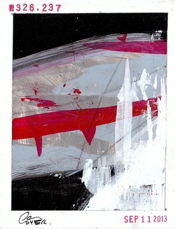
A couple of sets from Christopher completed on September 11, 2013.
| 520-955-9025 |
|

|
|
0 Comments
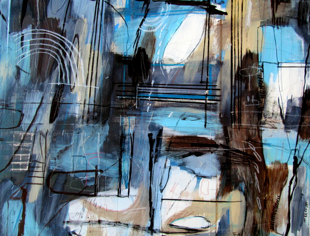
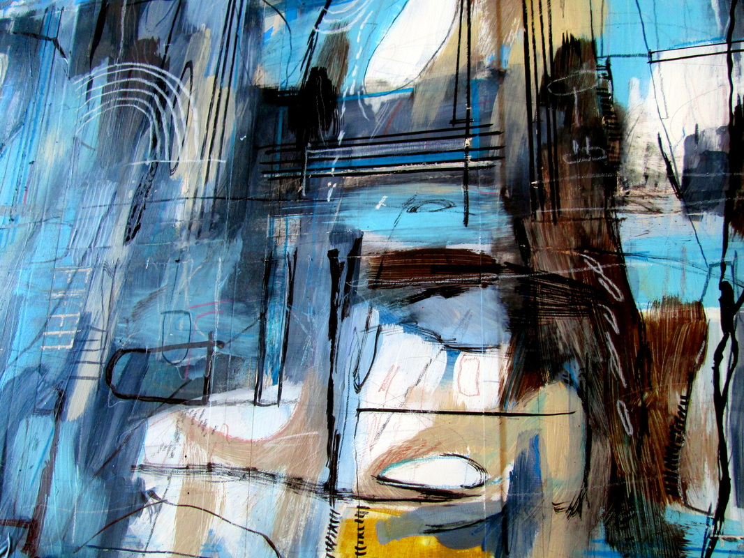
 This is my scan of piece #324,987. This is my scan of piece #324,987. I have this love/hate relationship with technology. I'm confident that my great friend Kim would probably say it had something to do with the fact that I am born on the cusp of Virgo and Libra. I'm not sure about this but I do know that one of the things that I like about the One Thousand Thousand project is that it hits on both a technical and creative level which appeals to me greatly.
When I'm creatively tapped out I can switch gears and do the technical stuff like documentation and web updates and that sort of thing. And one of the major aspects of this project is the documentation of it. The dreaded scanning of the work. I complain about the scanning a lot but the truth is I kind of make it my meditation for the time and I certainly don't hate it. But what I do find really frustrating is the fact that quite often the pieces I scan end up not looking exactly like the actual pieces. The color is sometimes a little off. And ultimately I try and correct the things with software and am mostly satisfied. [The pieces I end up posting online for sale are always reviewed to make sure the scans are accurate.] But I've constantly run into trouble with some colors. Hot pinks and bright oranges just never seem to translate and until recently I've sort of just accepted this as the way it is with scanners and certain colors. This morning I got a nice email from artist Frank Phillips and he let me know that the piece I sent him had arrived and that I had included an extra piece and he wondered if I had made a mistake. He scanned the piece in question and I was floored by seeing the colors of it represented so accurately in his scan. My scan of piece #324,987 is above. And the scan of the same piece from Frank is just below.  Some process photos of two separate sets that I've been working on for the last two days. The blue set is finished and was completed on September 16th and the green-ish set from September 17th is just now finished but I'm waiting for the ink to dry. I loved figure drawing class in college and was really, really good at it. I loved using the little ink pot and I could get some of the most amazing results using India ink and some stick I found on the ground and kept all through college. I like that I've started playing around a bit more with the ink. Anyway, these look great already and I'm looking forward to you seeing the finished pieces. 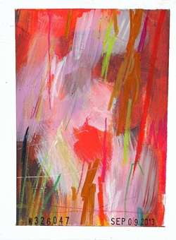 I'm never not surprised by how good this set is each time I see them.
If you search online for terms like "why does my scanner never seem to be able to correctly scan colors like hot pink and bright orange" you'll find plenty of instances where people seem to be frustrated about the same issue. This set is a classic example of such a thing. The hot pinks I used in these does seem kind of muted. The photos included with these scans do a bit better at capturing the colors. Anyway, these are some of my recent favorites. 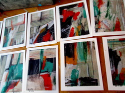 I did this little set of 12 in near record time. I think that from start to finish I was done in about an hour and a half. I say this not to serve as some sort of accolade-seeking accomplishment but to make it clear that I really didn't allow myself much time to overthink things. [And then overwork things.] When I just sort of turn off any though
Anyway, I'm really pleased with them as a set and individually I think they are all really, really strong. I'm opting to keep this entire set as 6 separate pairs. The scans and some process photos are just below. 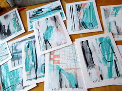 I'm not sure why I'm slowing down a bit more lately. It's not that we're trying to make a million pieces of original art and we're running out of steam. It's something internal I'm feeling about the latest pieces I've been doing and the most recent approaches I've been using. That's something that I'm working on figuring out though and I'm having some really productive dialogues in my head about the whole thing. And that's just another aspect of this project that causes me to appreciate it so much.
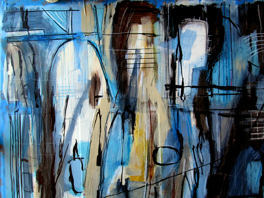
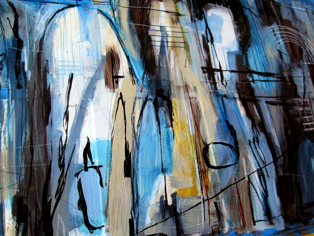
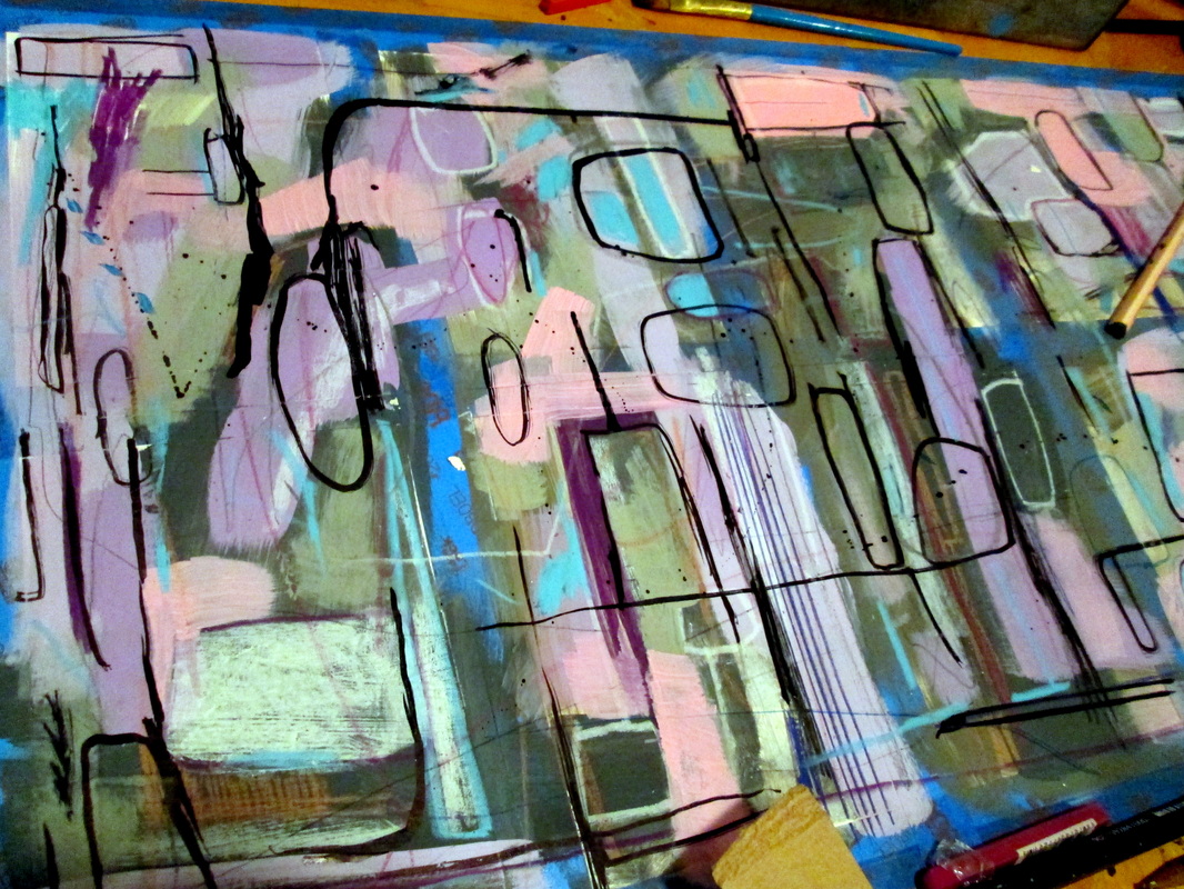
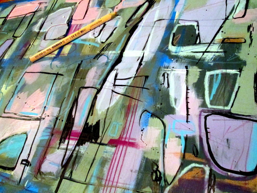
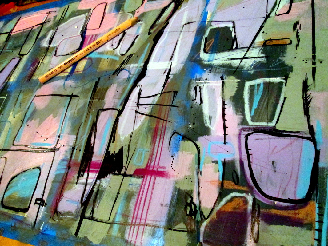
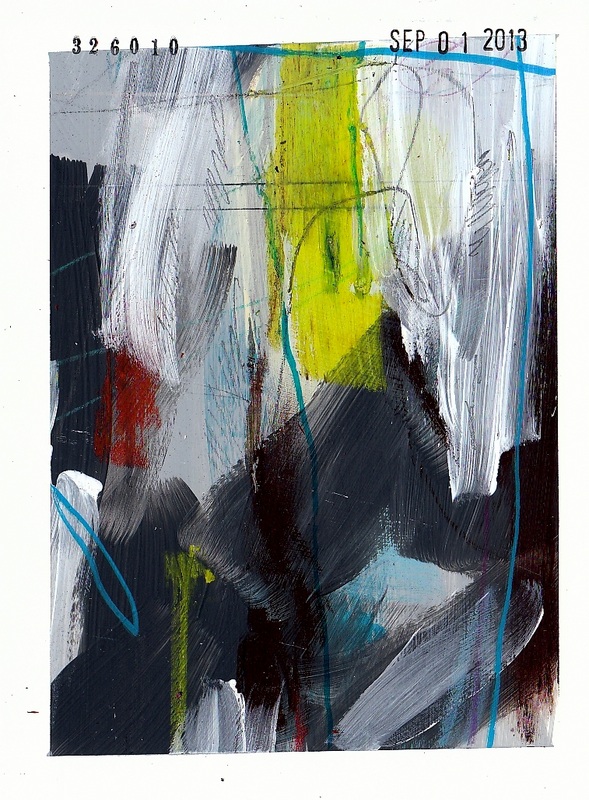
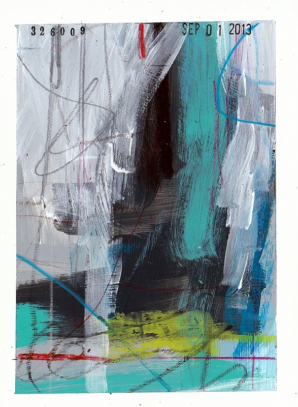
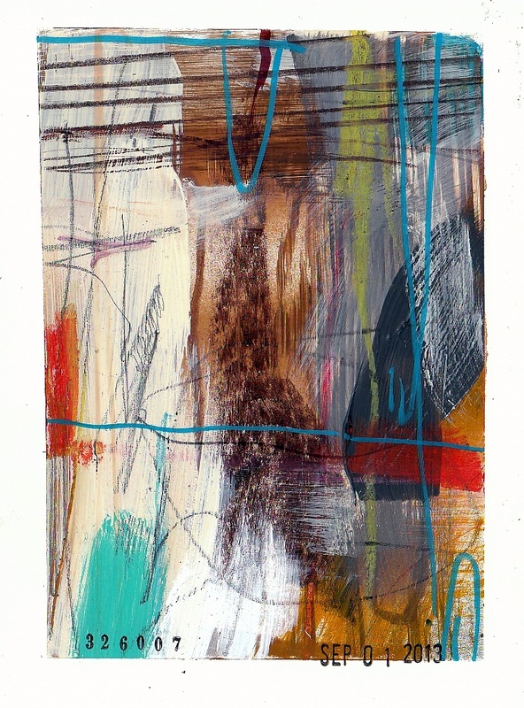
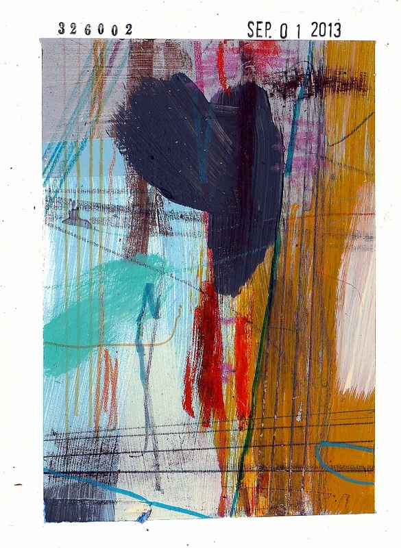
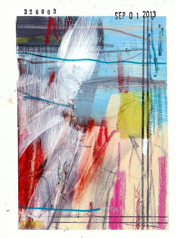
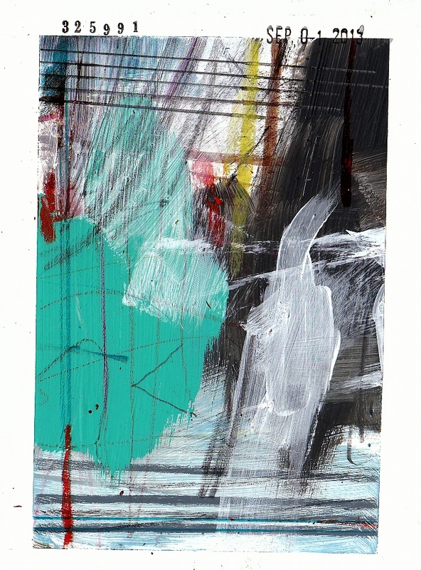
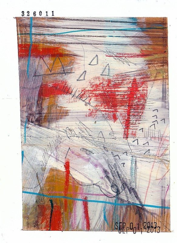
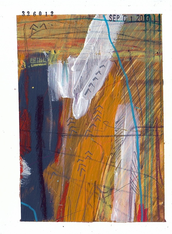
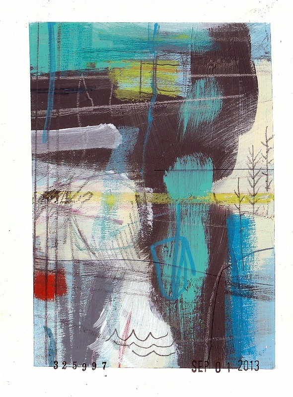
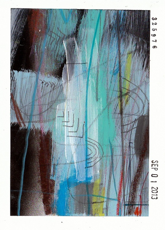
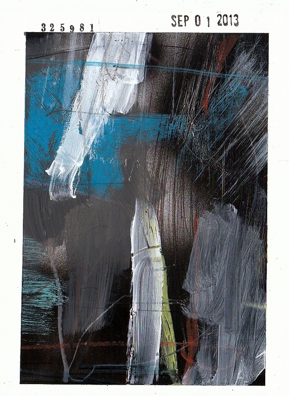
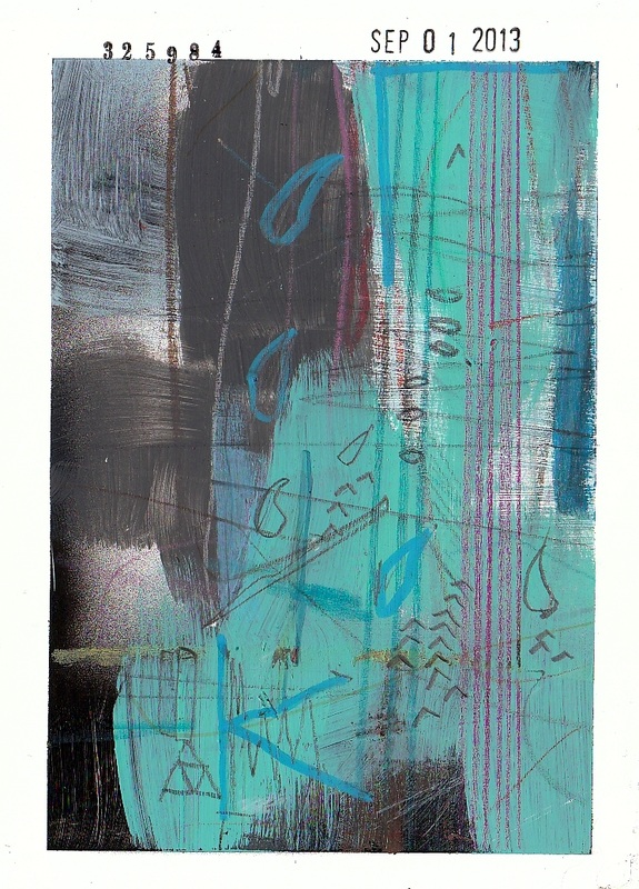
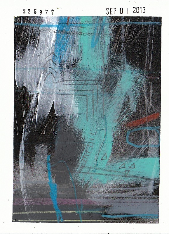
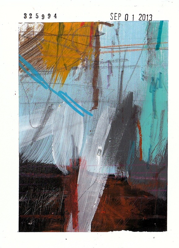
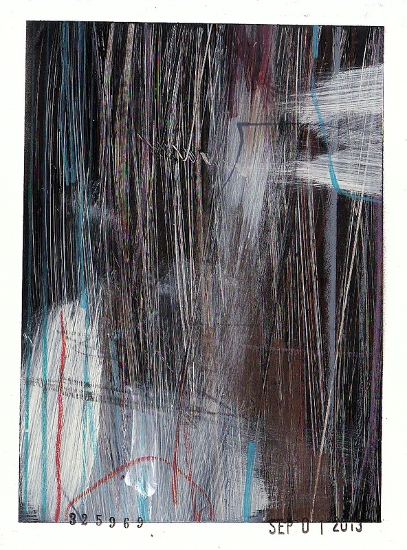
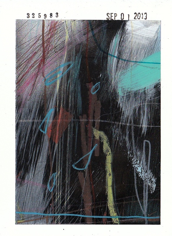
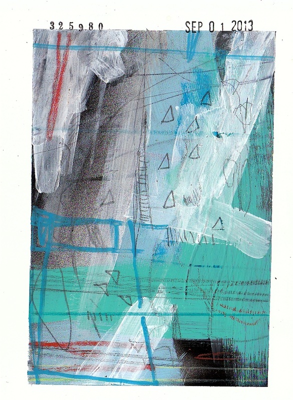
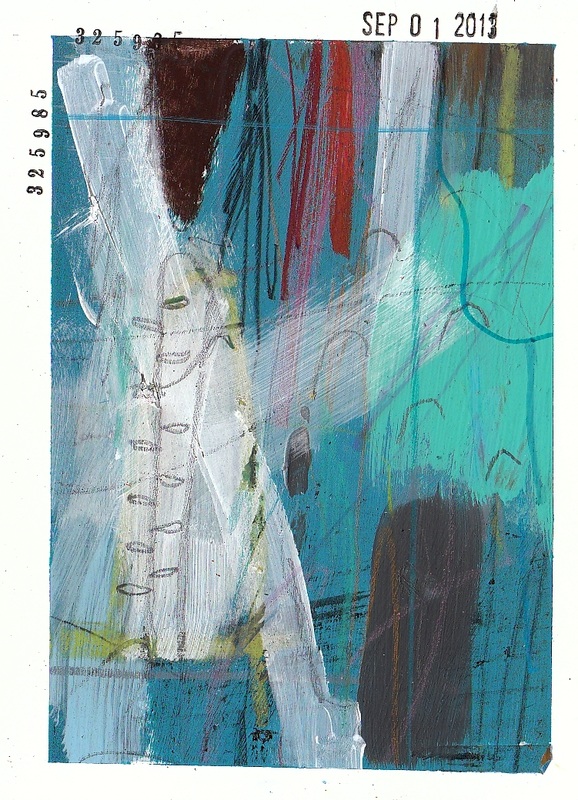
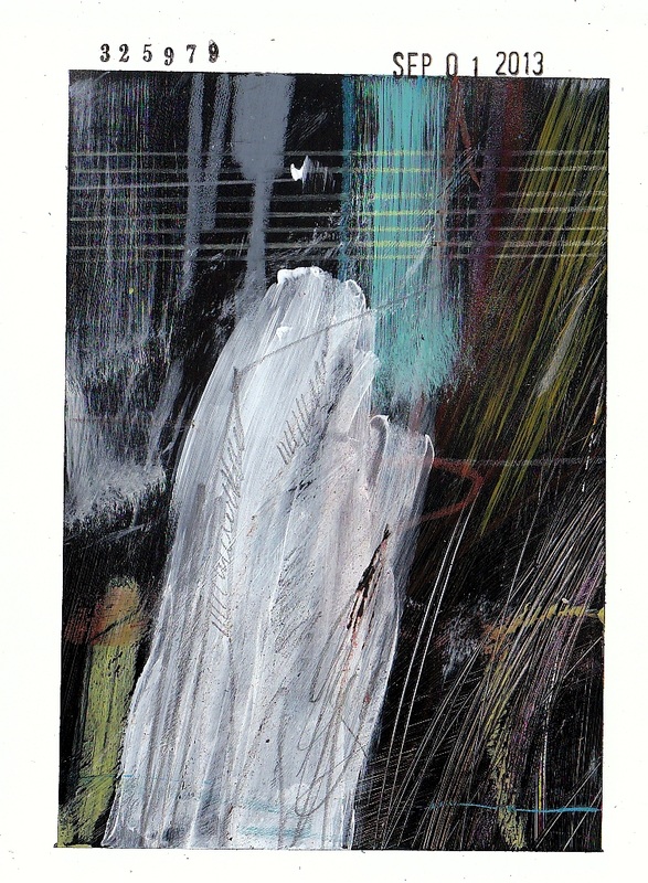
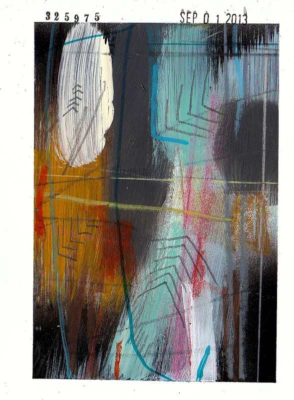
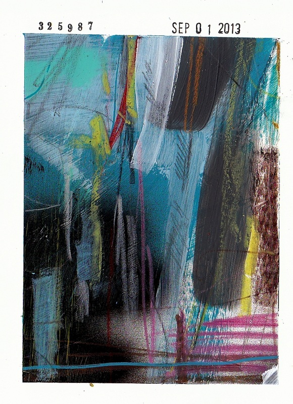
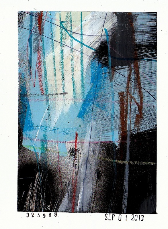
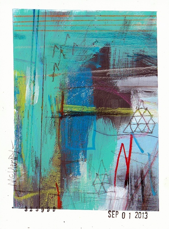
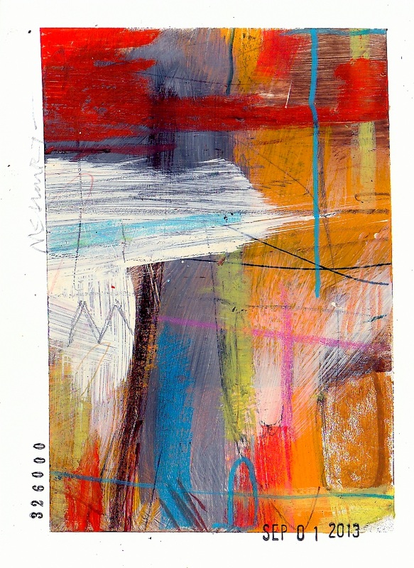
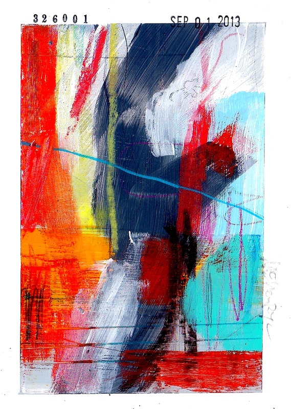
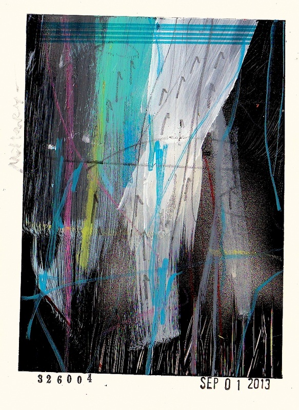
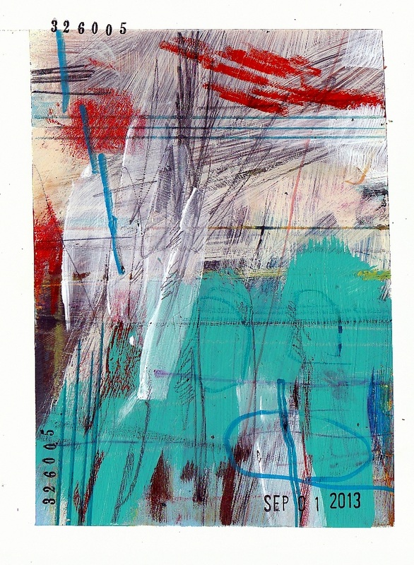
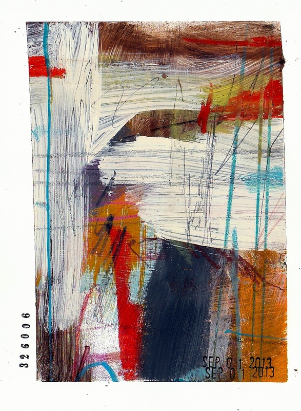
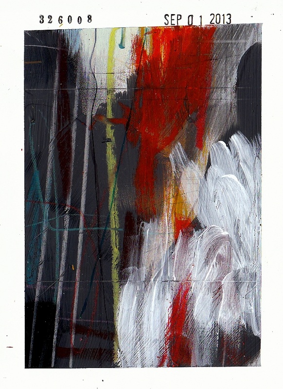
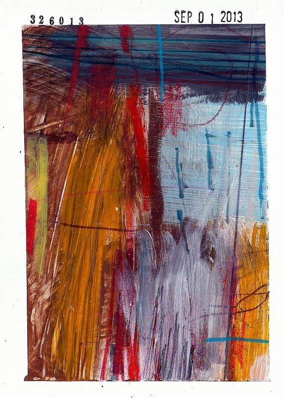
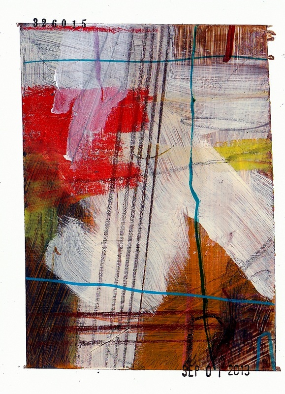
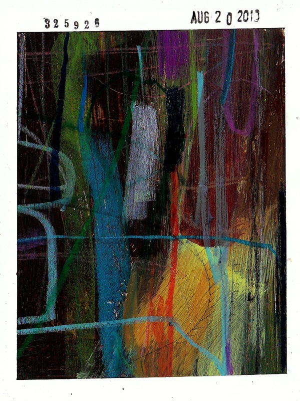
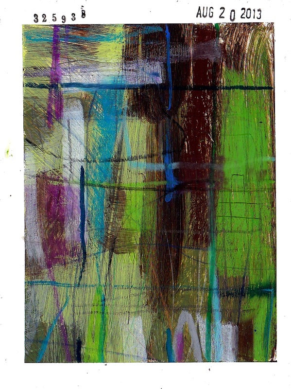
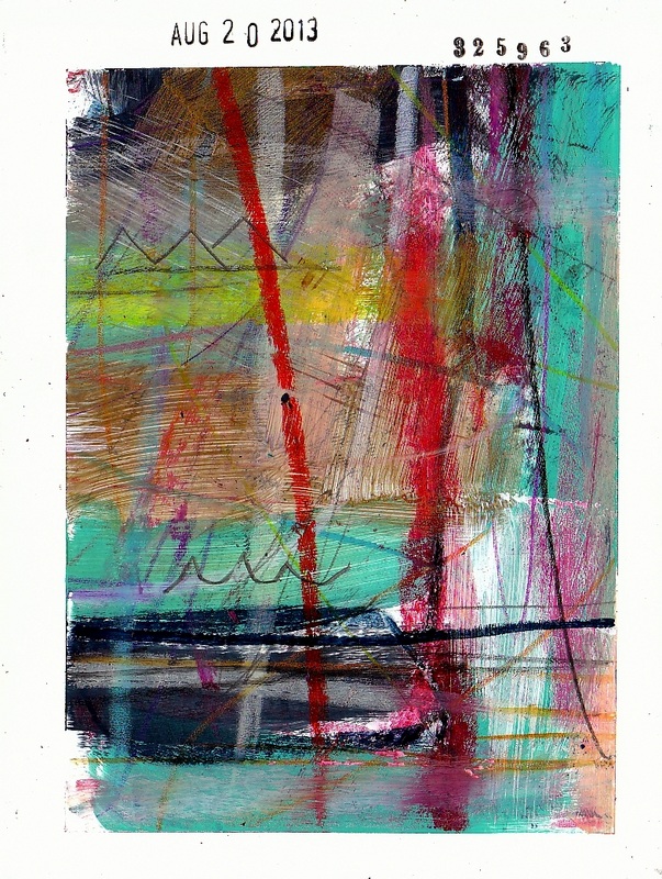
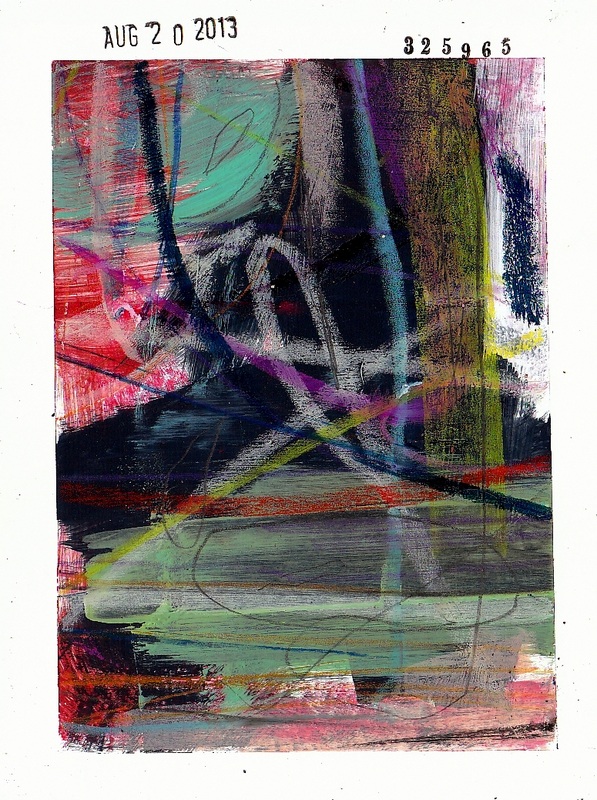
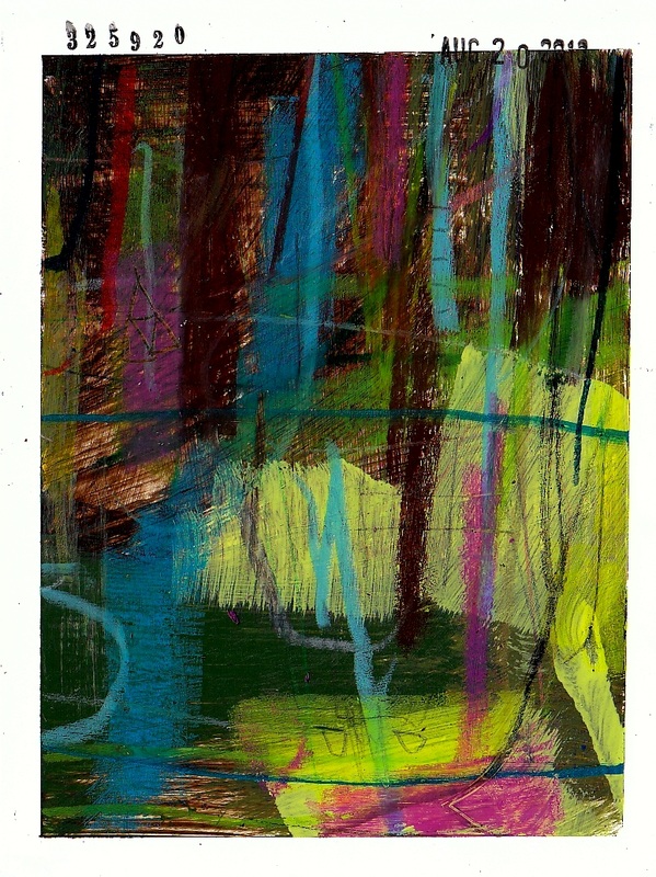
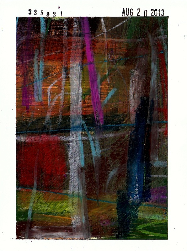
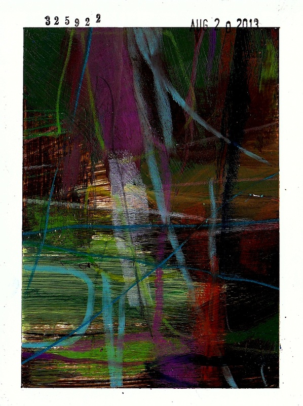
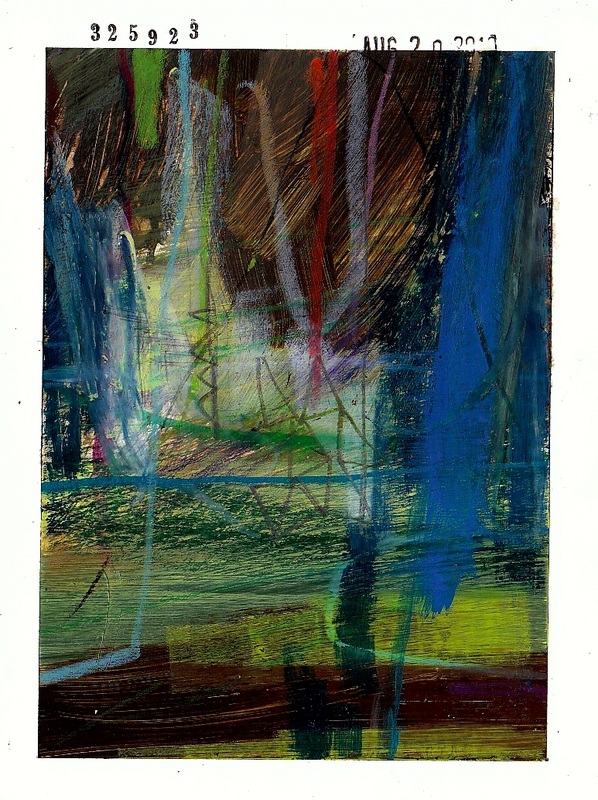
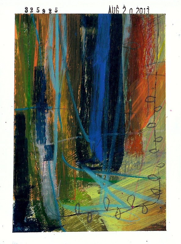
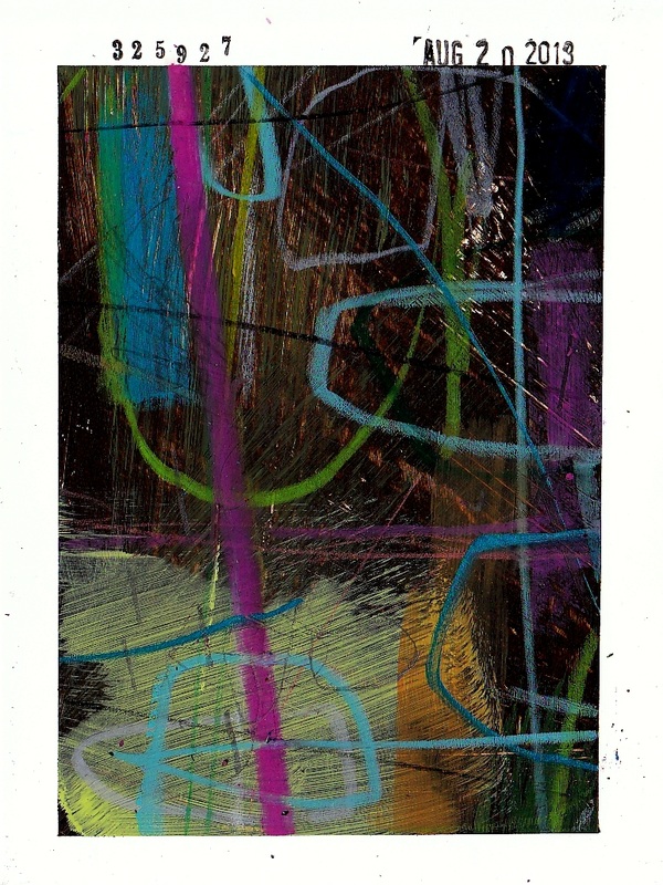
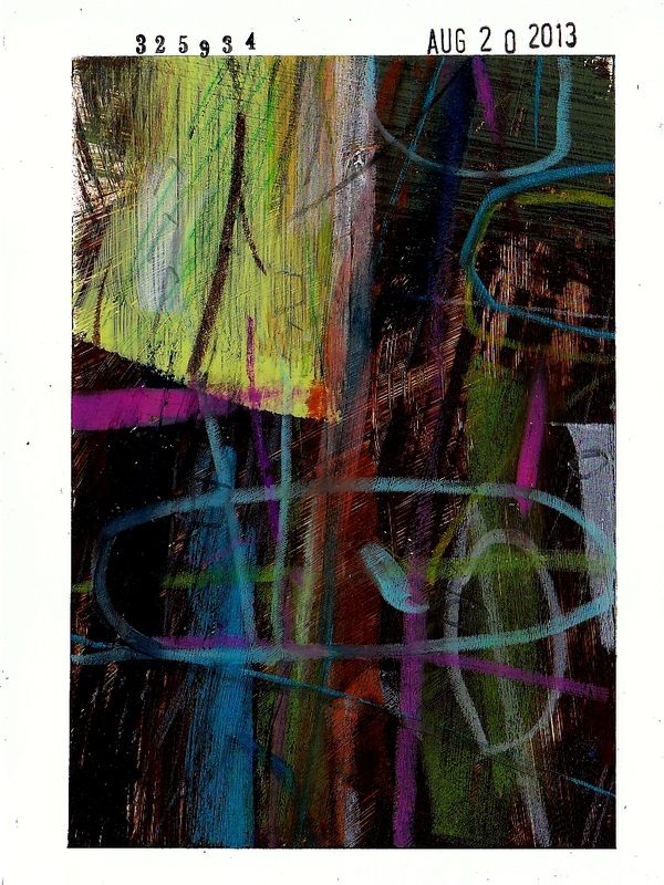
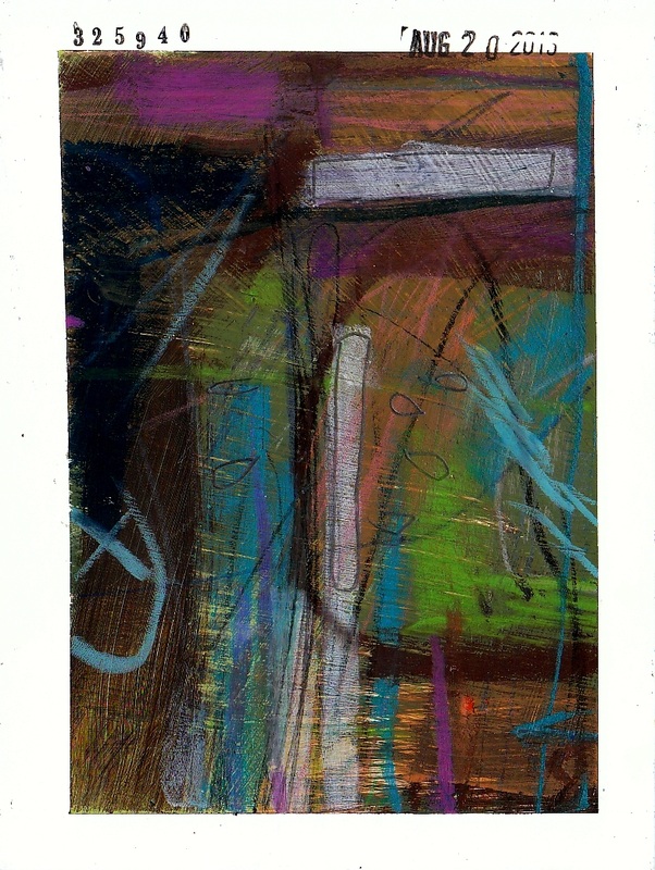
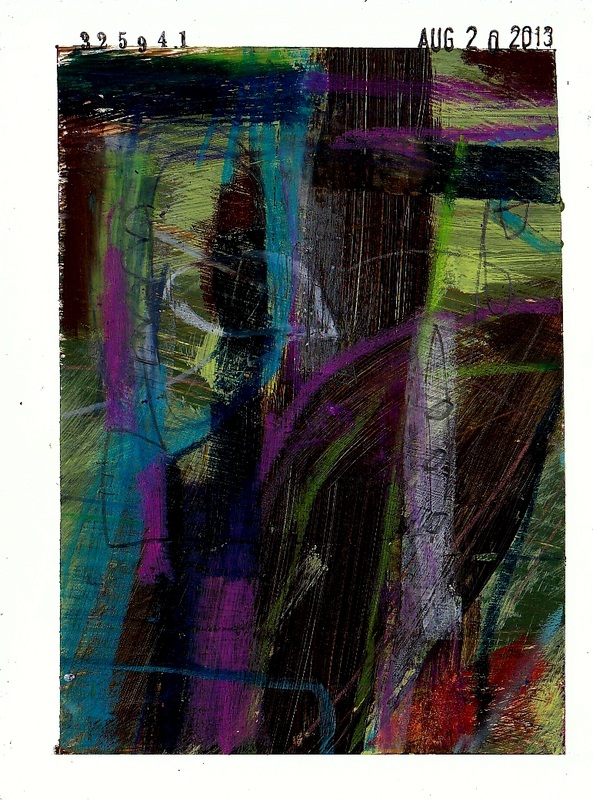
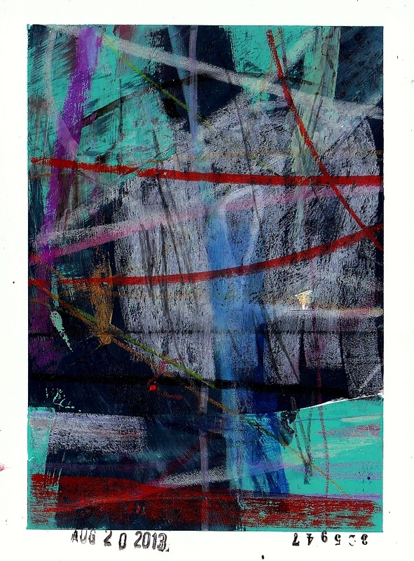
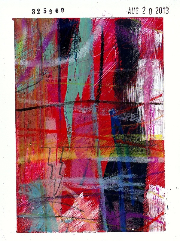
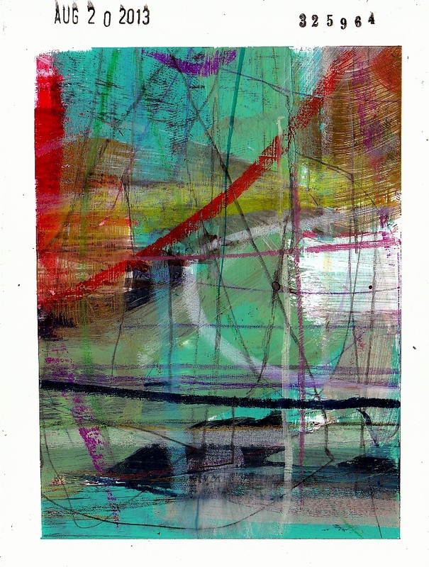
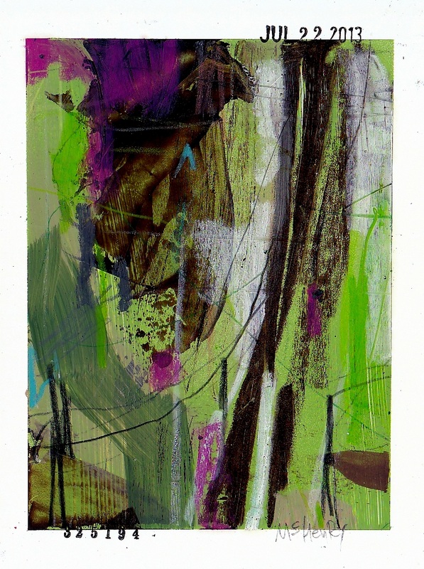
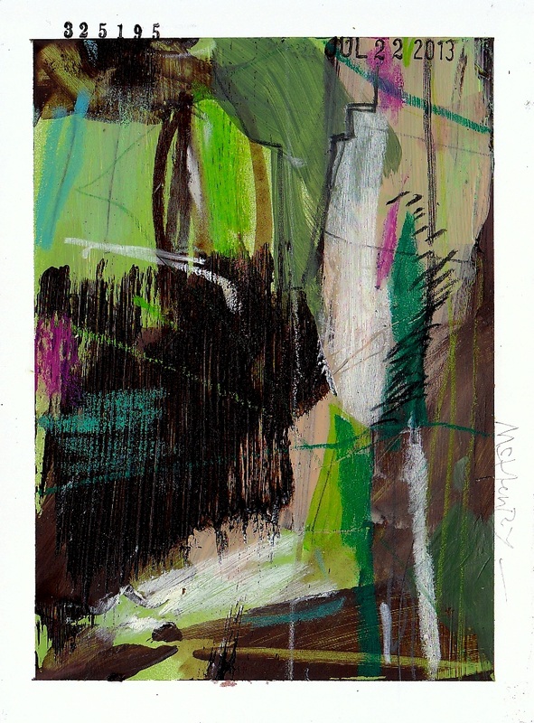
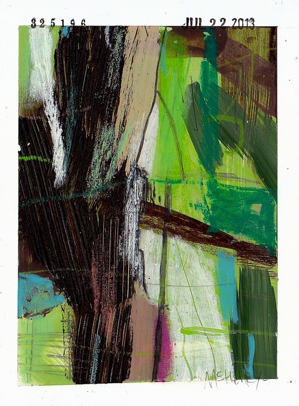
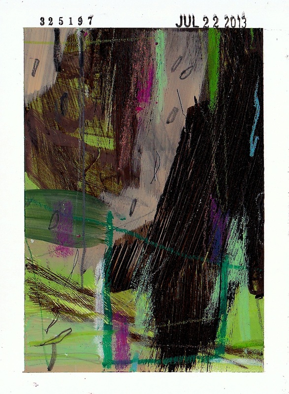
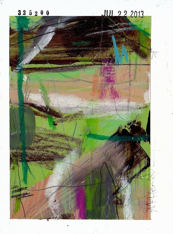
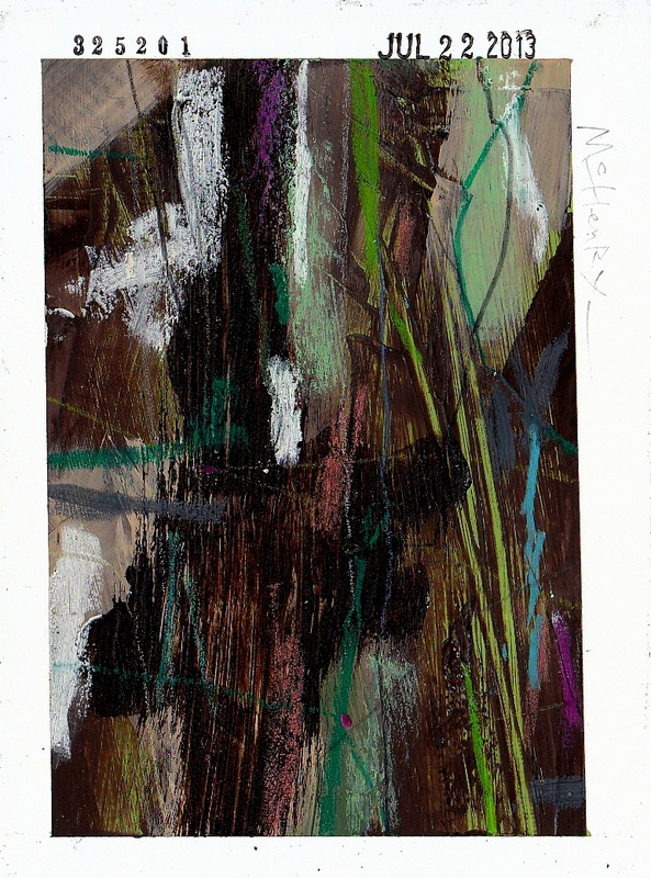
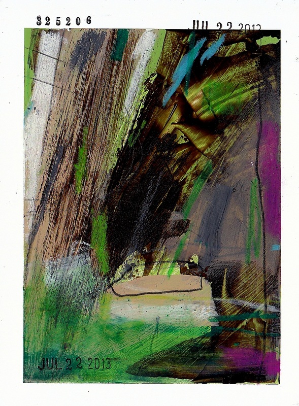
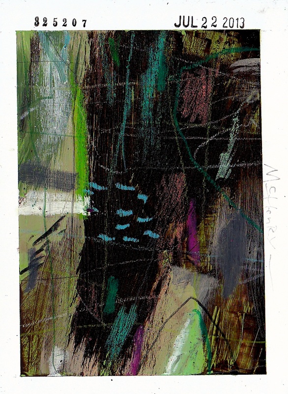
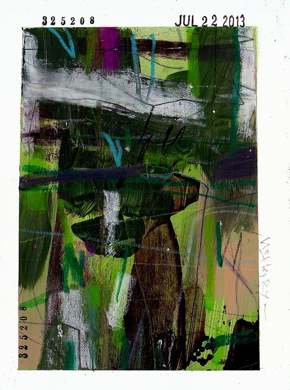
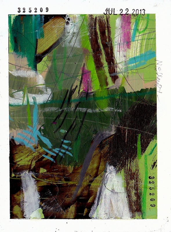
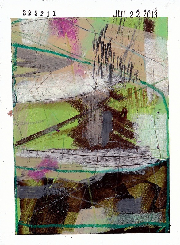
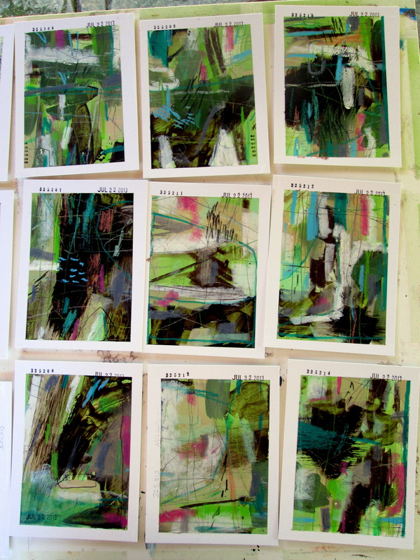
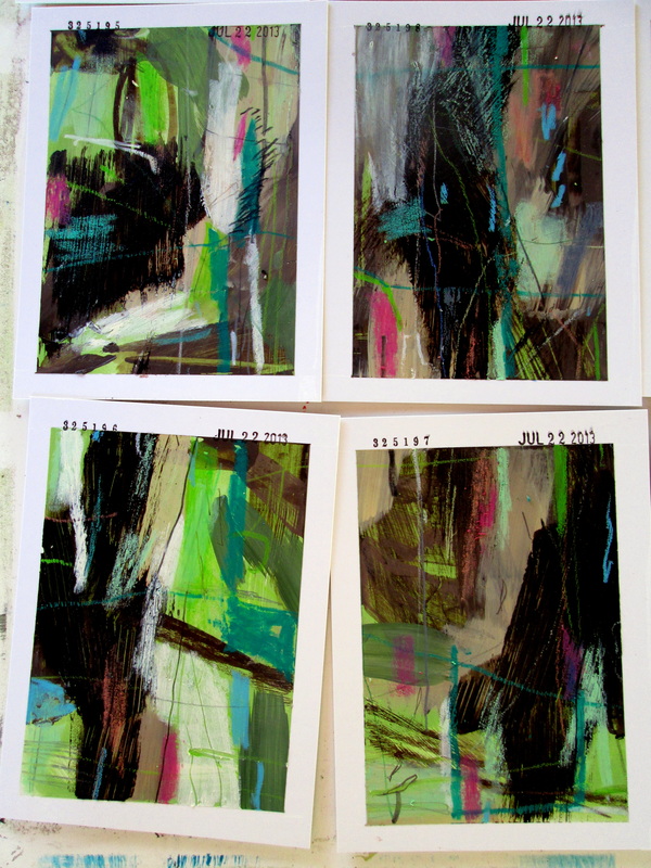
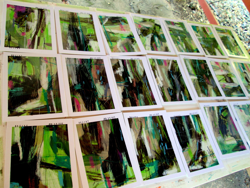
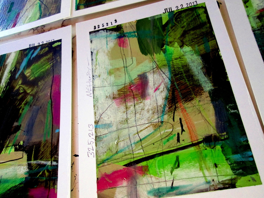
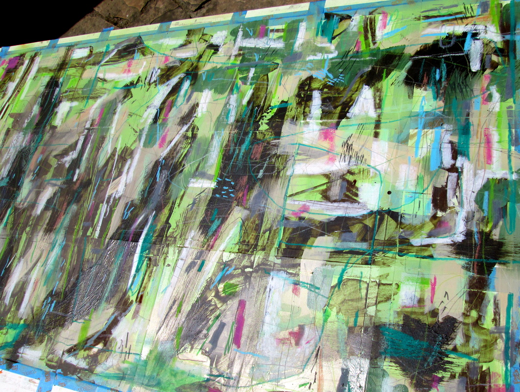
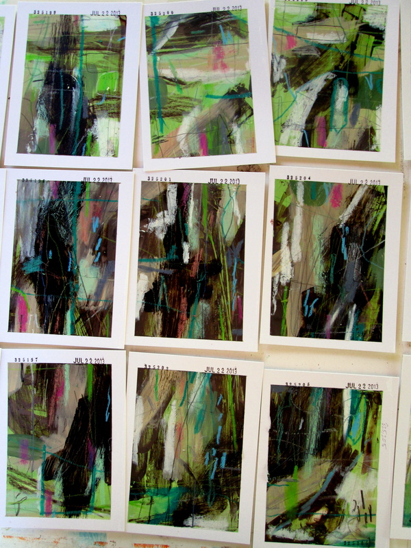
So I have been doing these smaller sets and for this one I used the matte side of the boards as opposed to the glossy side. The matte side works better for more delicate mediums like watercolor and I have some turquoise ink I wanted to use. I really like this set and it's great to have a project or exercise such as the One Thousand Thousand project to kind of serve as a reason to keep pushing through whatever rut you feel you might be in. The results will not always be what you expected and they won't always be perfect but they'll still be results. And just having results is, in some Socratic sort of way, perfect by default. Scans and some detail and overview photos are included. 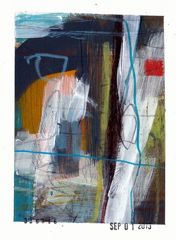 A set completed on September 1, 2013. I'm just now getting around to scanning the whole batch. I've included some process and overview shots of this batch as they were being created and those are just behind the Read More link. 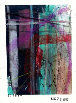 I did a few sets at a live painting event at KALEID Gallery. These sets were done along with a couple of other people working on them with me. These are scans of the pieces created that evening. And some progress and overview photos too. 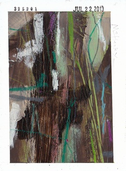 This set was completed on July 22, 2013 and I am incredibly pleased with every single one. I remember feeling a bit overwhelmed this day and was probably anxious about the show that was coming up on August 2, 2013. I had a lot to do that week and was not really into making more paintings. I decided to do something different and I used a jar of school paste to generate some texture. I colored the white paste with brown acrylic paint and just sort of added it around in areas. The results are fantastic and these look really nice. It took a day or so for the glue to even dry completely and I ended up grabbing these pieces and using them in the show without ever scanning them first. I sold some of them before I remembered I hadn't scanned them all. I pulled the rest and kept them aside and I just now had time to scan them. Some additional overview and detail photos of this set as it was being completed are also included. Some detail and overview photos of this set are posted just below. It got dark outside as I was finishing these so some of the photos are certainly not the best. Apparently I overlooked scanning this set and I realize that a good number of them were sold off at the show last weekend. This is precisely why I have tried to get into the habit of photographing these things as I finish them. There are 21 pieces in this set and they are #325,194 through #325,214. Anyway, I'll scan whatever pieces I have left over. Until then here are some overview photos.  Still another set from July that I really like a lot. The image at left is a detail of the group as it was being completed and I'm also including a handful more of those in-the-process shots.
Most of these went pretty quickly at the South First Fridays event over the weekend and I'm glad that people liked them as much as I do. The texture on these is pretty great and I realize that I want to do some more that incorporate some seriously tangible textures. The photos are just below the Read More link. 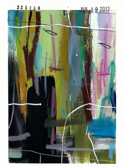 The set that was done on July 19, 2013 is kind of a mixed bag for me. About exactly half of them I am incredibly happy with and the other half don't entirely work for me. I dunno. It happens like that sometimes.
I used a portion of the colors that I had still laying out from the set done earlier and in that sense they look like they are related to the July 18, 2013 set. I have learned a lot from making art over the years and one thing for sure is that just because I love a piece doesn't mean everyone else will. And just because I'm not entirely won over by some of the work doesn't mean that others will feel the same way. Whatever. I don't know why I feel the need to make excuses for any of my work. It's ridiculous. The rest of the pieces from this set as well as a couple of overview photos are just below. 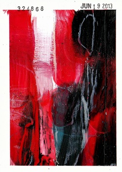 This little set was done on June 19, 2013 and I'm only just now finished goofing around with them. I used beeswax as the primary medium. I say this as I wouldn't yet be comfortable labeling these as something more formal like encaustic pieces. Not even close. Just beeswax.
The wax is pretty thick in some areas and I carved into them a bit and they have a really nice texture to them. Still, after about a month of fooling around with them I'm finally satisfied with how they turned out. They are nice enough to look at. The rest are just below behind the good old Read More link. 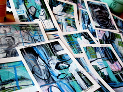 So I've been working on doing some demonstration type of thing that basically shows some of the techniques I typically use to create some of these pieces. It's something I want to make available to other artists that are interested in contributing their own work to the project or just making a few hundred pieces on their own for their own enjoyment.
With this idea in mind I took a ton of photos of the whole process from start to finish and this particular set was the one I was working on. I think in many ways this distracted me and it kind of caused me to overthink and then overwork a lot of the pieces in the set. Still, they are all okay. I don't hate them or anything. I just know I tried too hard and for a lot of them it really shows. On the other hand, I really like how a few of these turned out. I really, really like them. And that's one of the truly amazing things about this project. The results are usually really nice. Or, at least, it's pretty difficult to just fail entirely. Something good will invariably come out of it. UPDATE: The series of photos from this set are posted here. 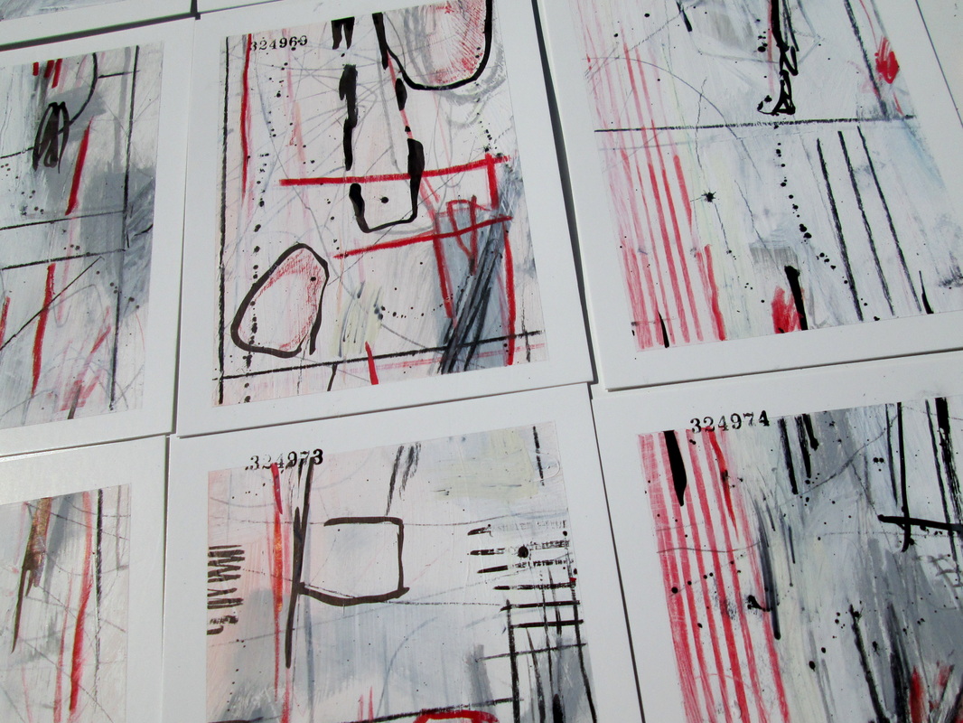 A small set completed on July 7, 2013.
I'm not sure what I think about these. The gallery is just below behind the 'Read More' link. 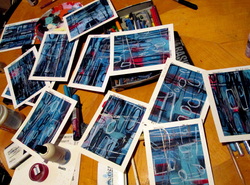 Scans of some of the individual pieces completed on July 6, 2013 as well as a few detail/overview shots of the group as they were being completed. There were just 12 done in this particular group and it took me a while to even like them. Started out with a field of red and ended up hating how it looked. For the most part I am satisfied with how these turned out and about half of them are really nice. The others are just okay and only a couple I'm not that into at all.
They are heavy with India ink and I'm not sure if the scans reflect it or not but there are some cool metallic silver gestures that really look nice. [I've taken to tucking these behind the trusty old 'read more' break. Not sure why.] 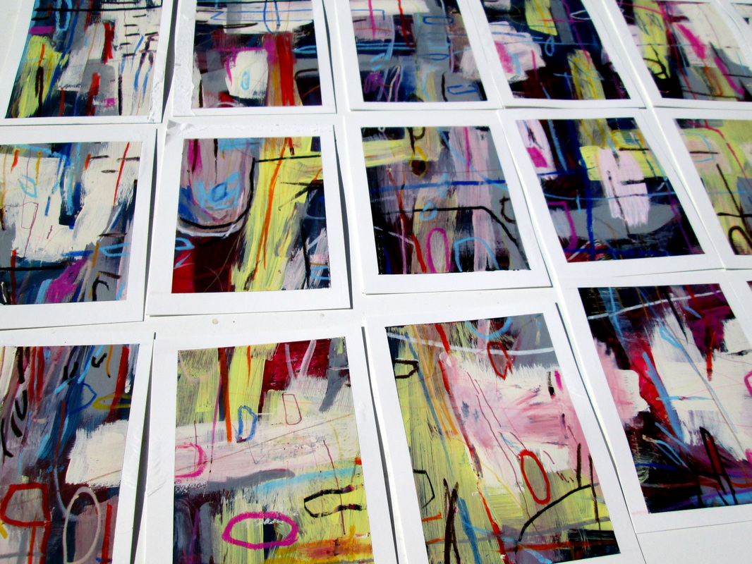 Some overview shots of a recent group of pieces as they were being completed. Individual scans are to follow.
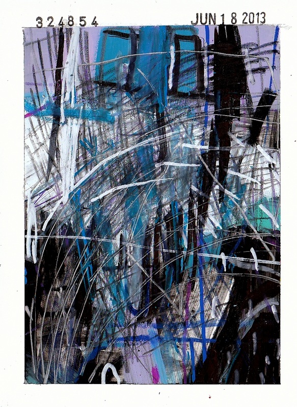
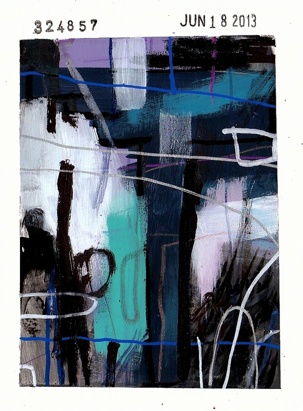
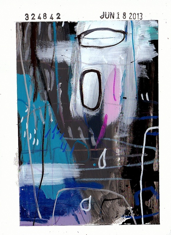
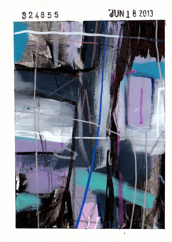
Some of the pieces that were completed on June 18, 2013. There were about 17 pieces that were done in this particular group and I've scanned six of them. I've also included some more photos of these pieces as they were being produced and those are just below. [Along with a fair amount of rambling that I've been kind enough to tuck nicely behind the good old Read More tag.]  It's essentially impossible to find the time to scan each and every single piece that is produced for the One Thousand Thousand project. Instead of scanning each individual piece we've sometimes opted to just photograph [or even video] certain lots of pieces as a group.
The group of pieces that were completed on June 14, 2013 are some that probably won't all be individually scanned. At least not today. |
Categories
All
Archives
August 2016
|
Popular Favorites
|
Contact Info
|
In Progress
|
|
|
|
|


 RSS Feed