
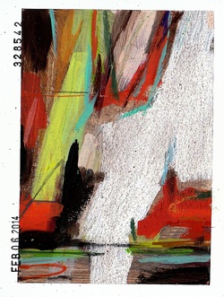
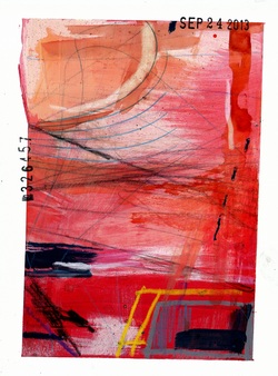
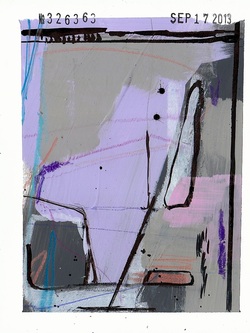
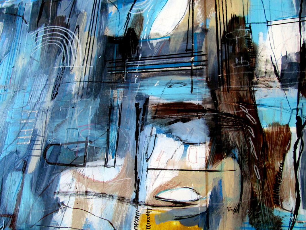
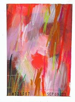
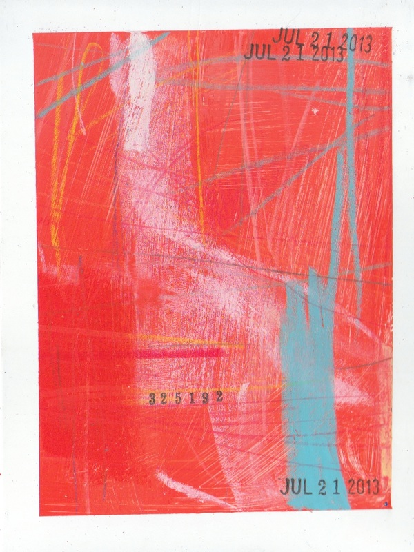
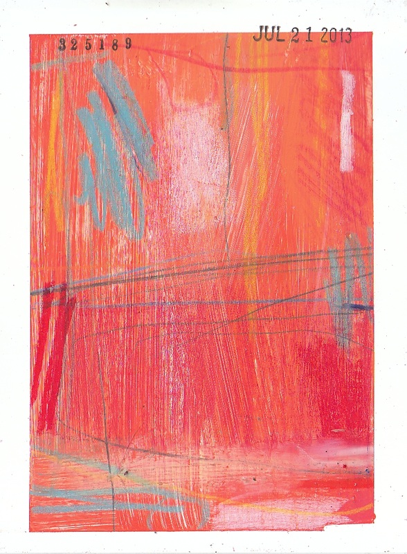
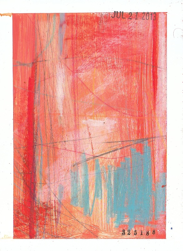
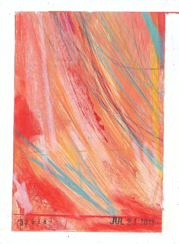
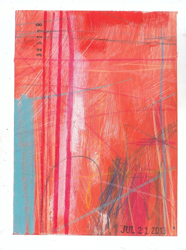
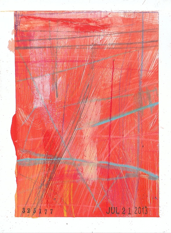
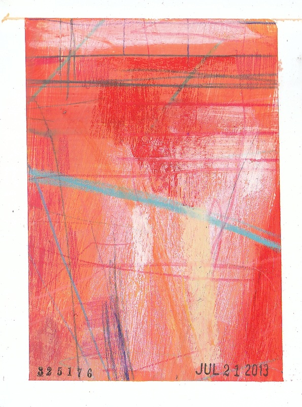
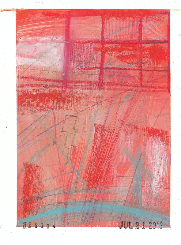
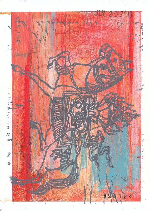
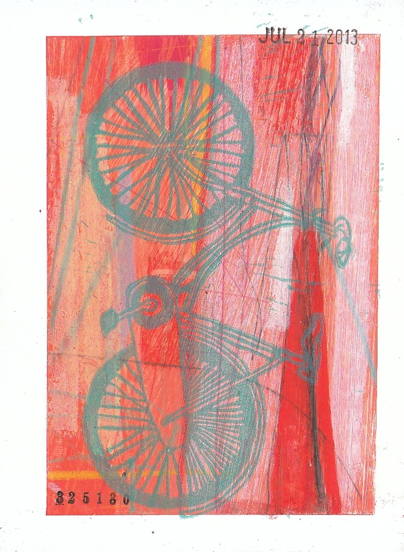
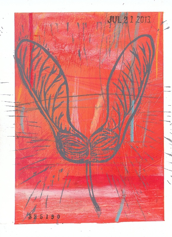
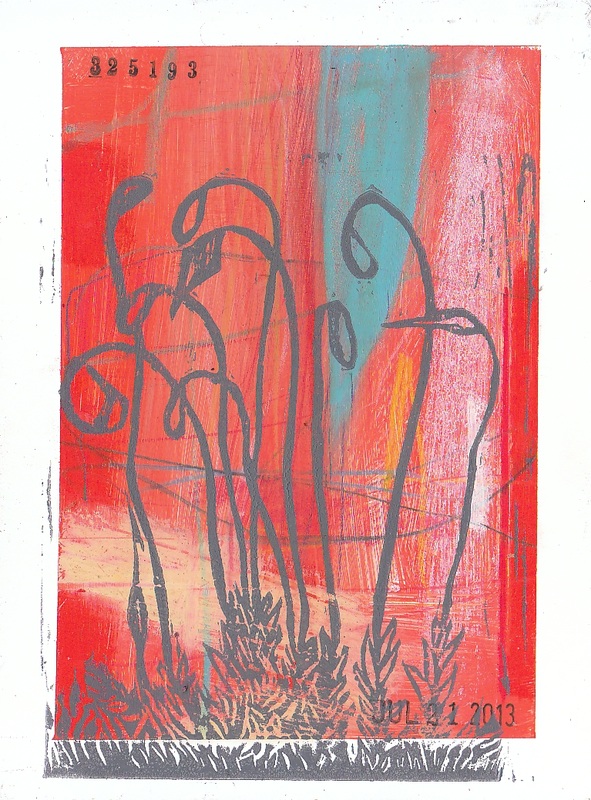
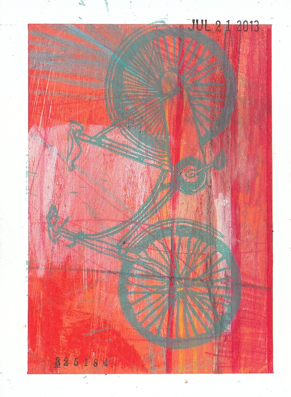
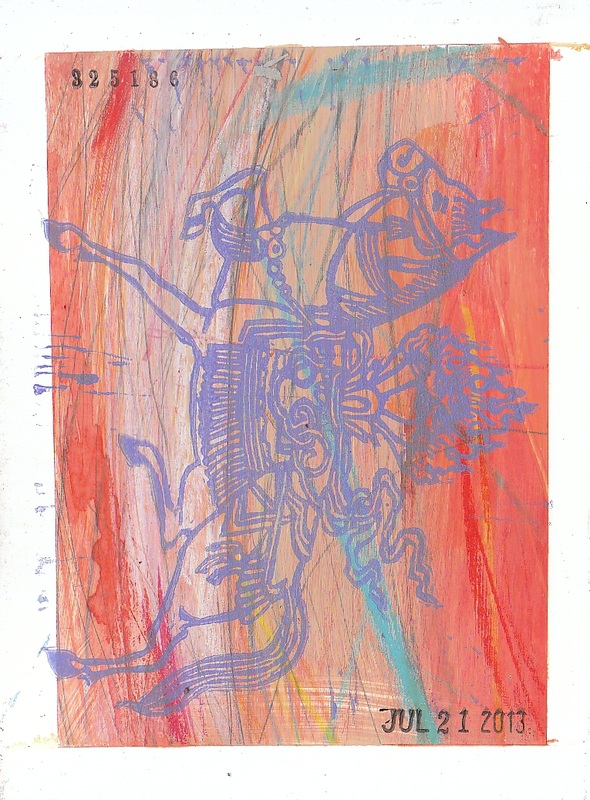
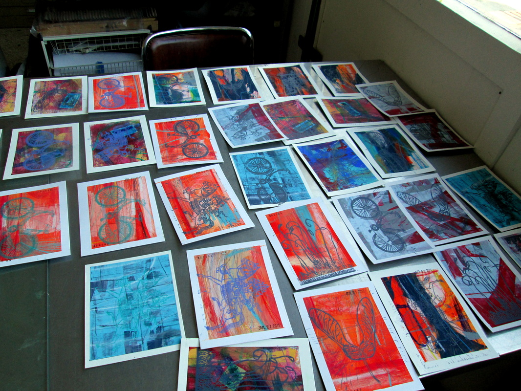
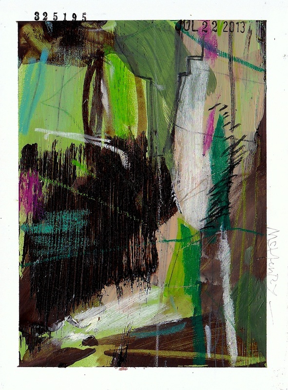
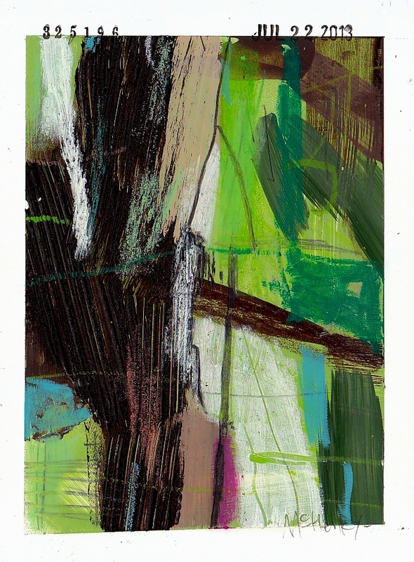
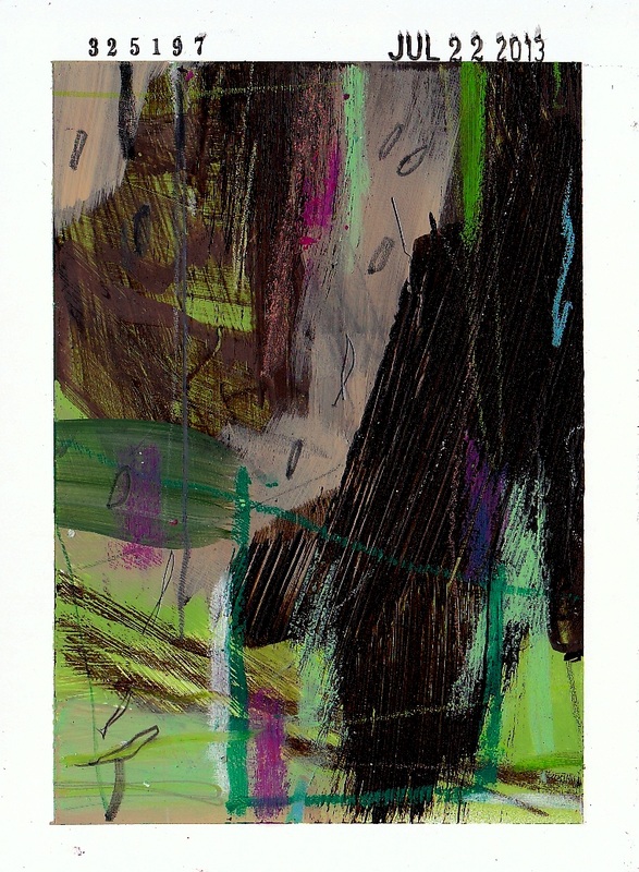
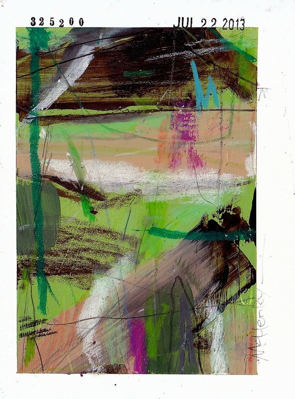
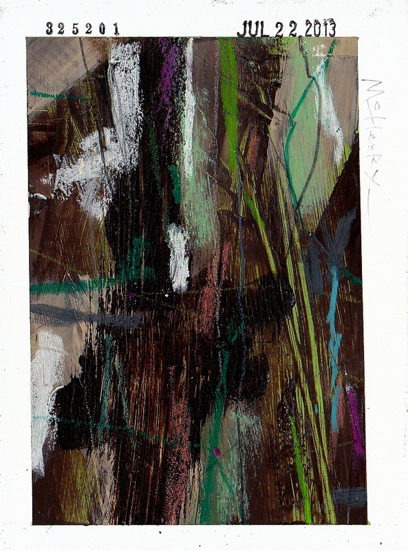
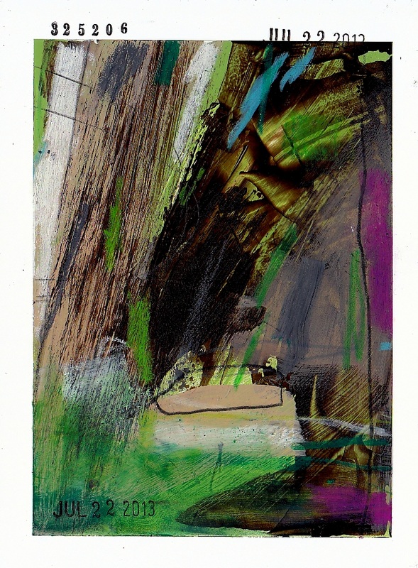
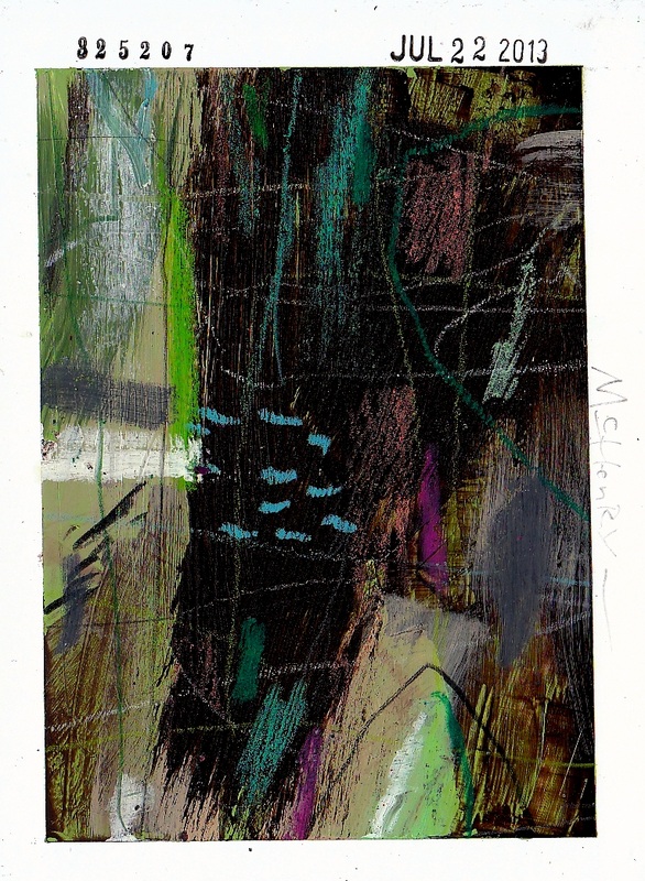
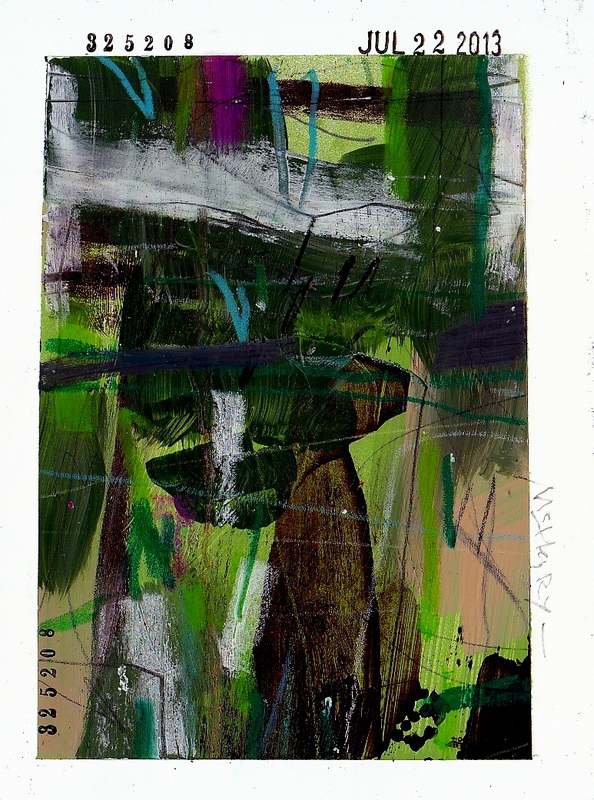
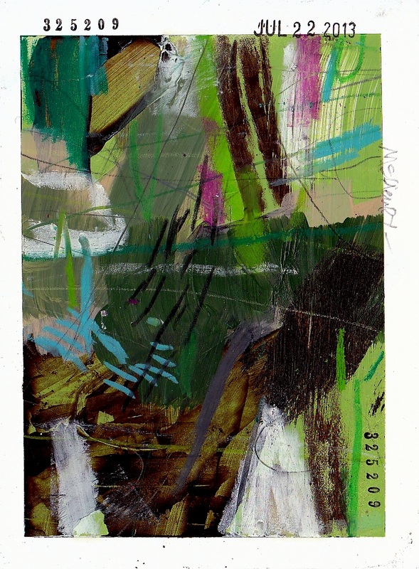
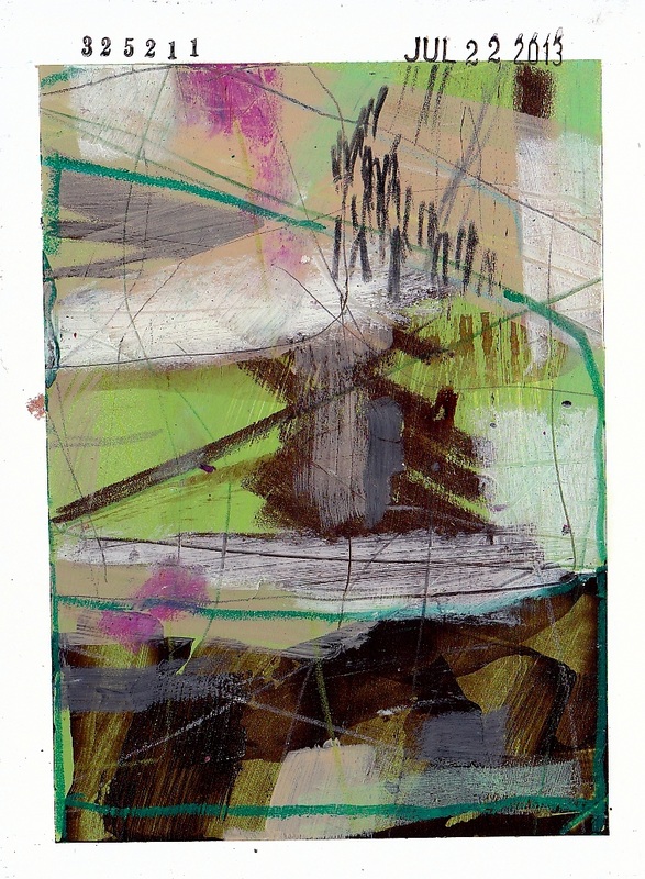
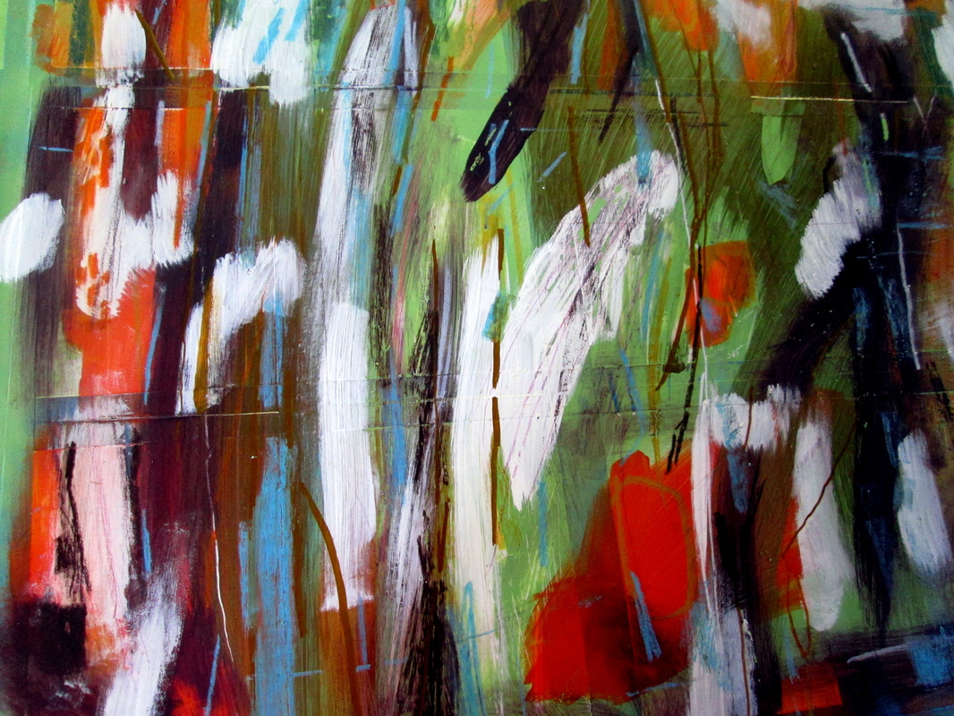
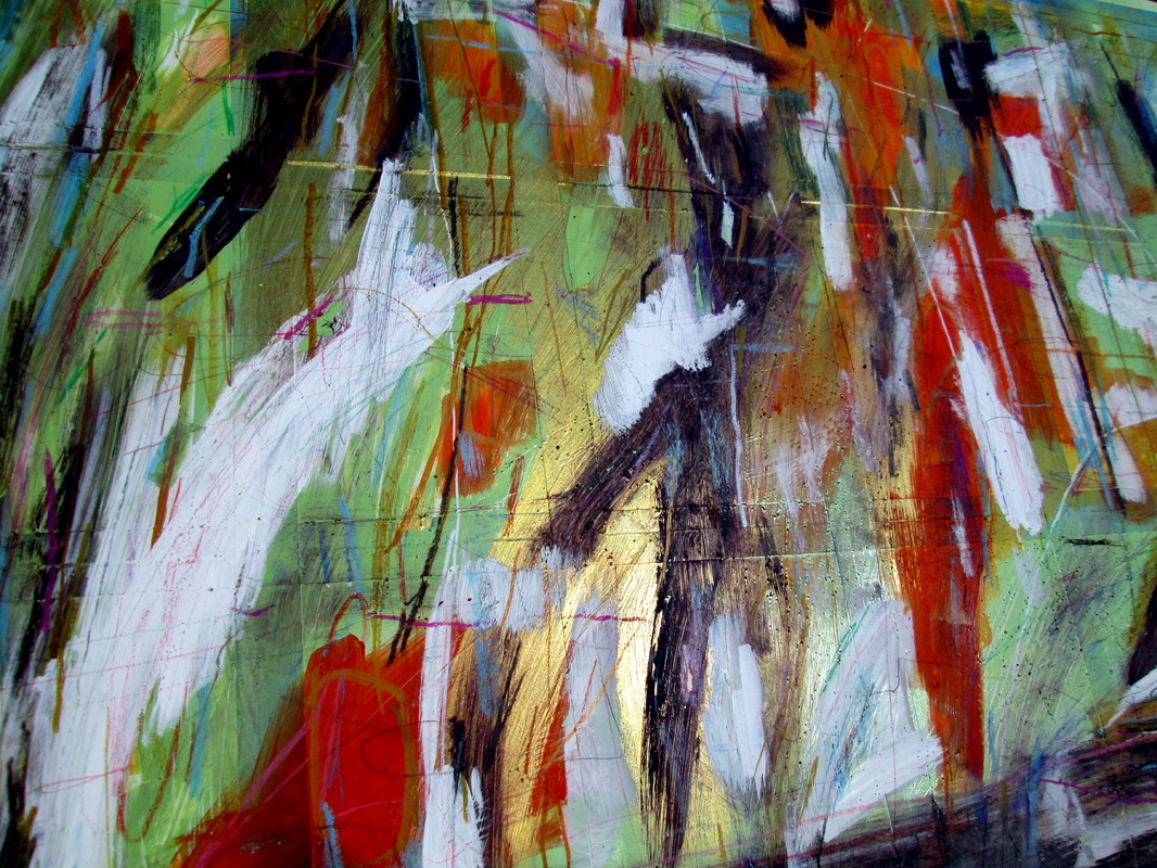
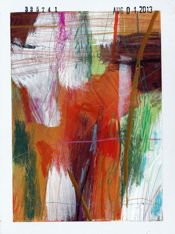
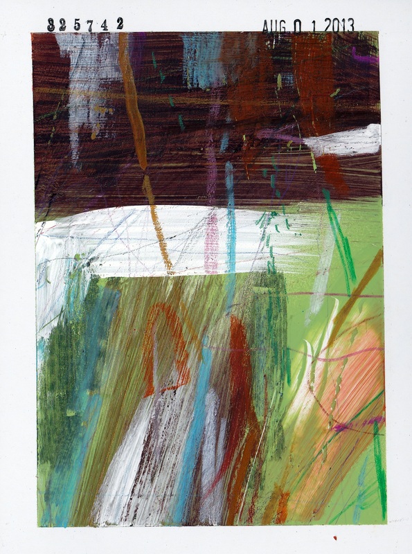
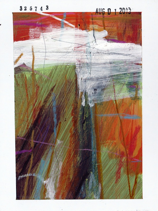
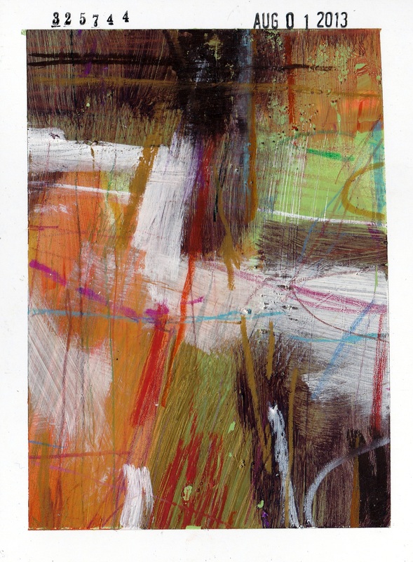
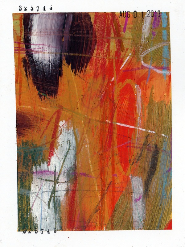
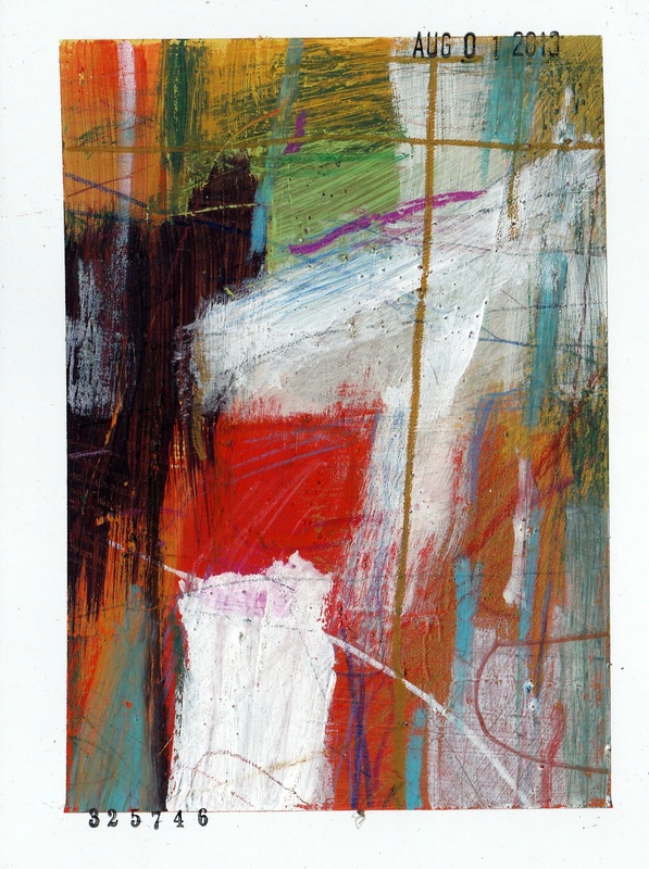
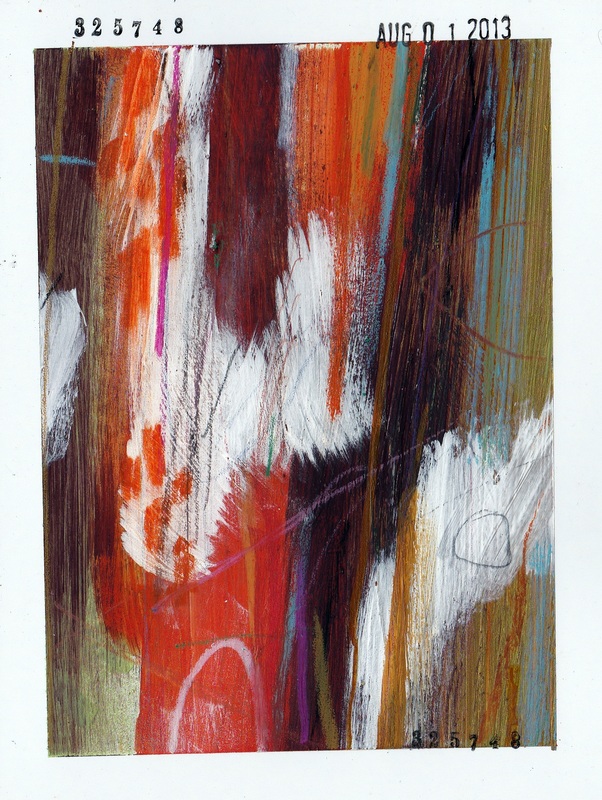
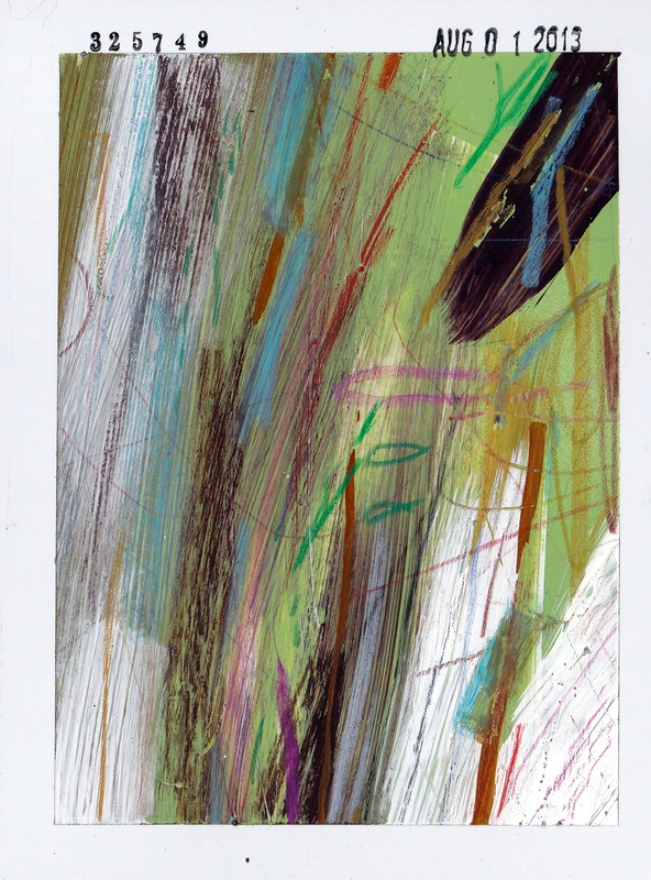
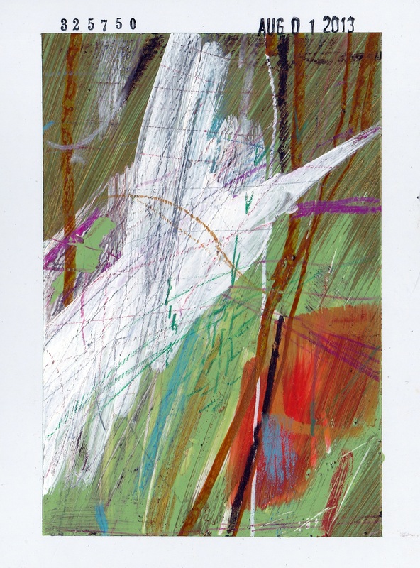
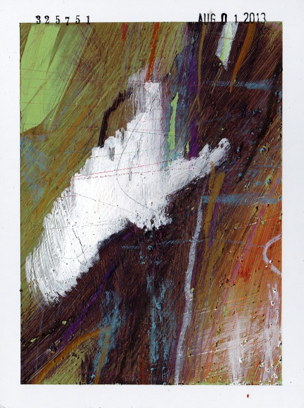
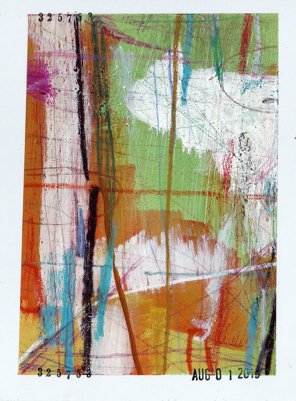
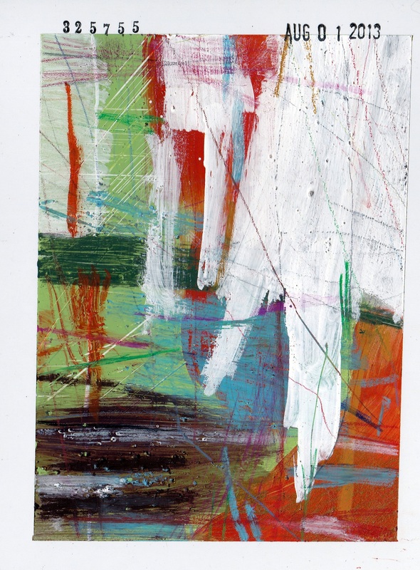
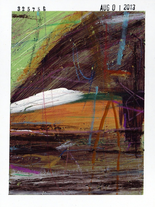
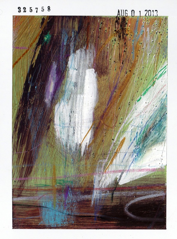
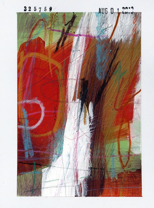
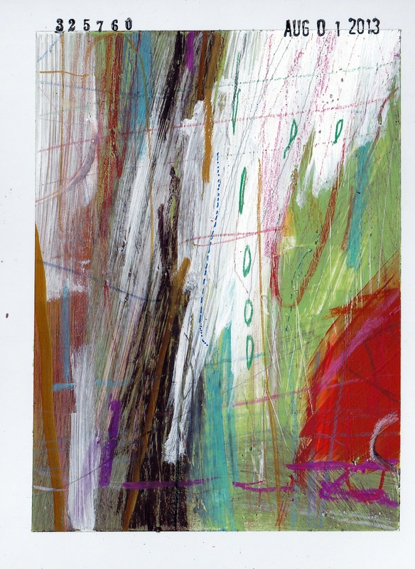
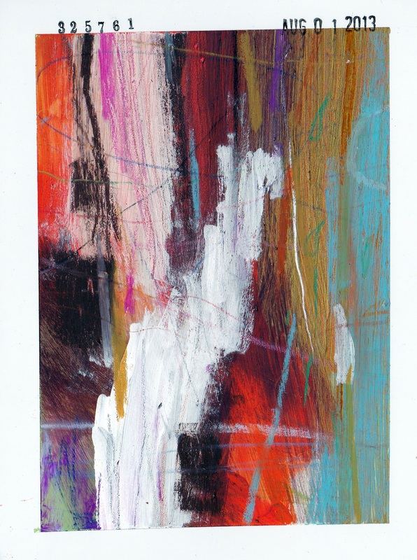
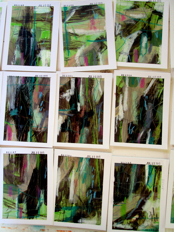
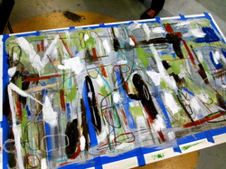
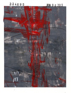
Some scans of a set completed on February 6, 2014. This set is a recent favorite and I ended up using some tile grout as texture for a few of these. The results were pretty nice and I'm really feeling like a shift in materials is going to happen really soon.
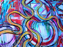
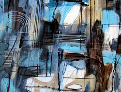
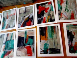
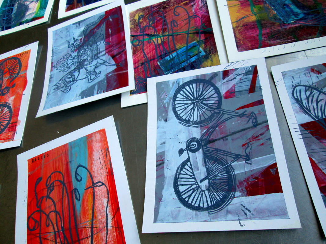
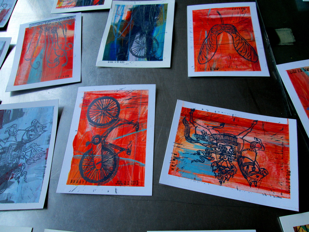
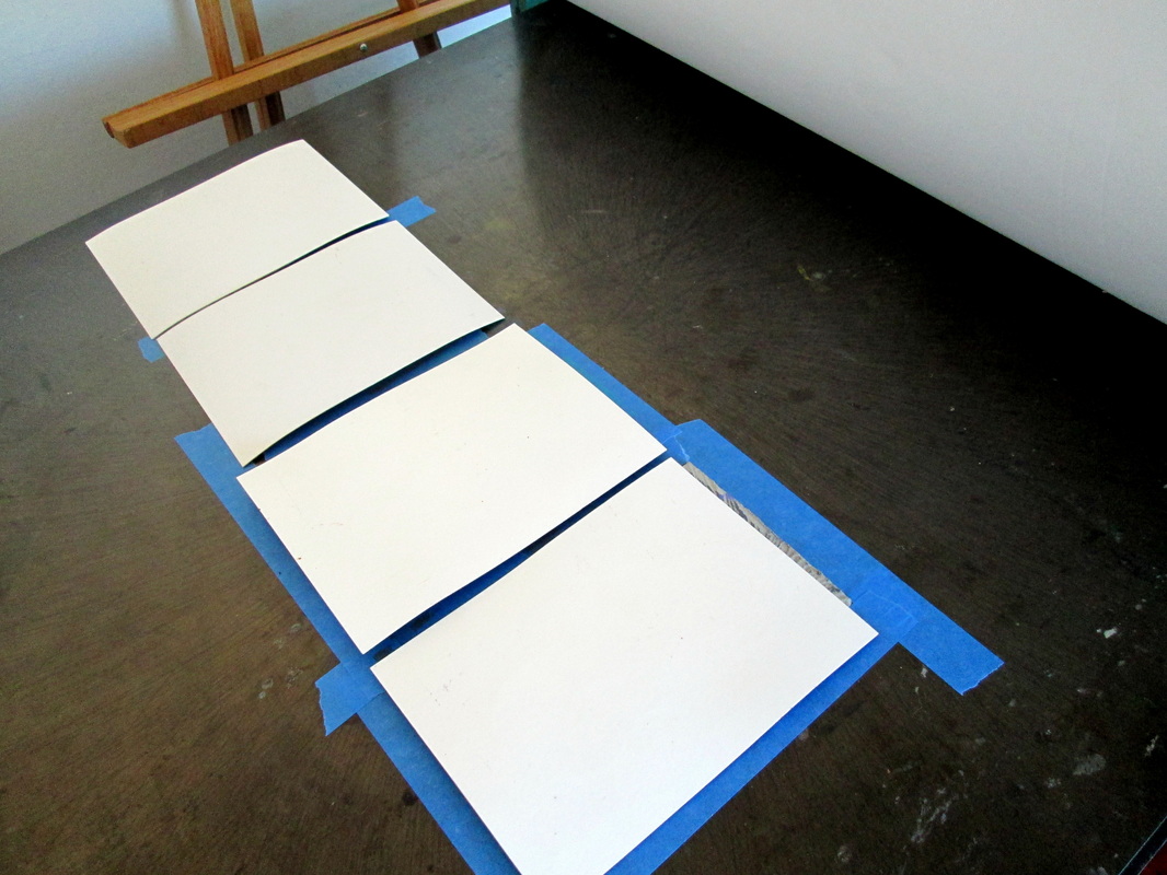
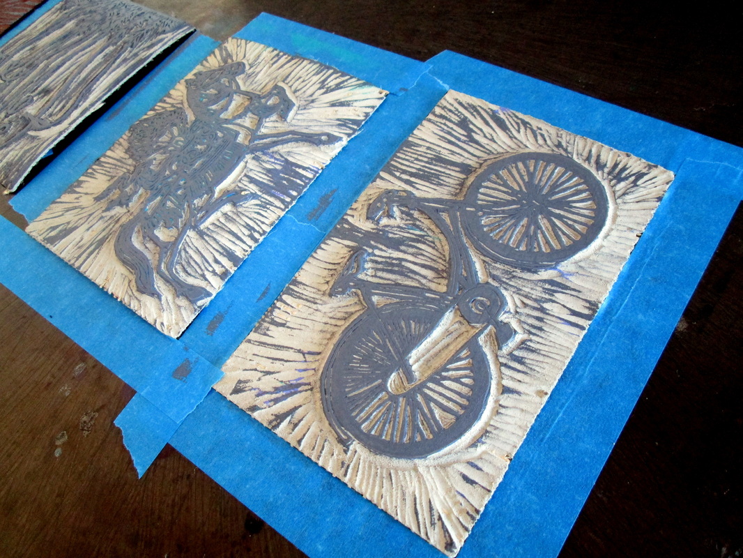
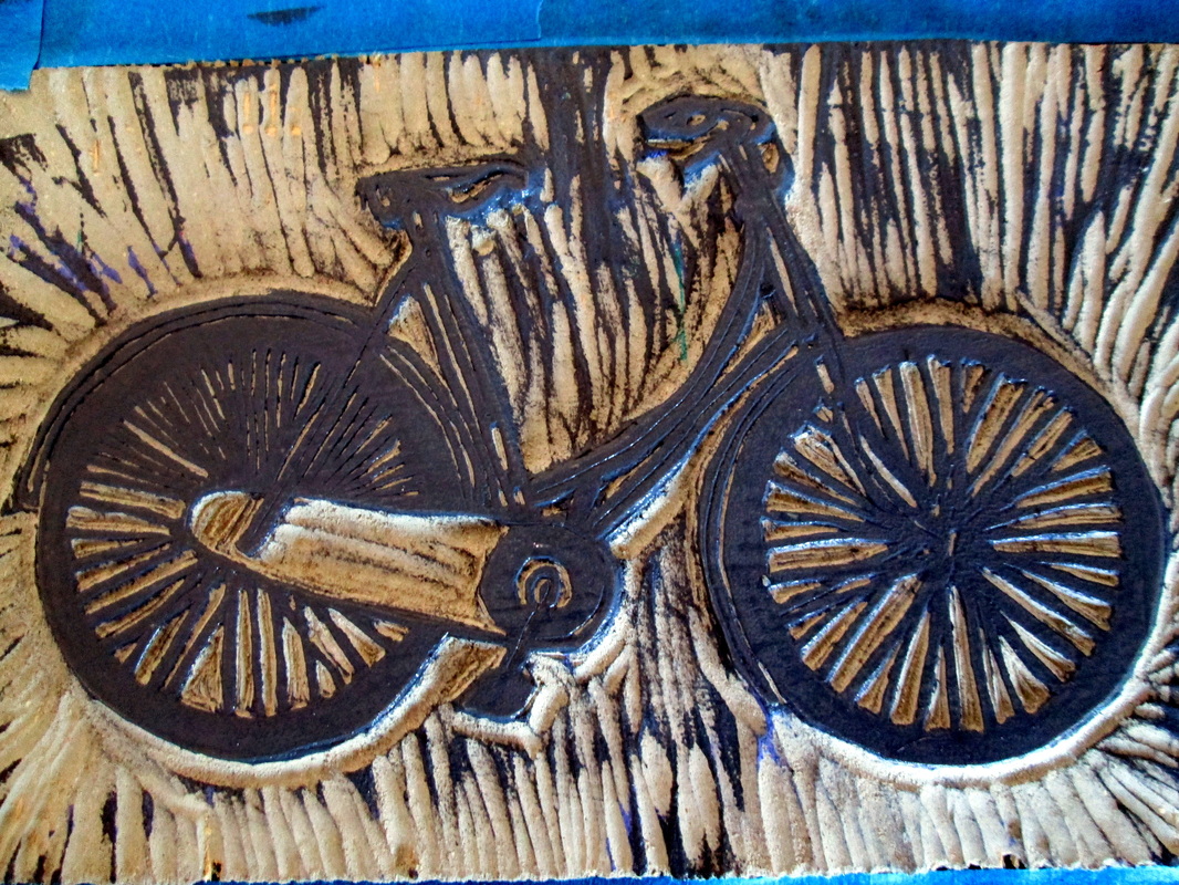
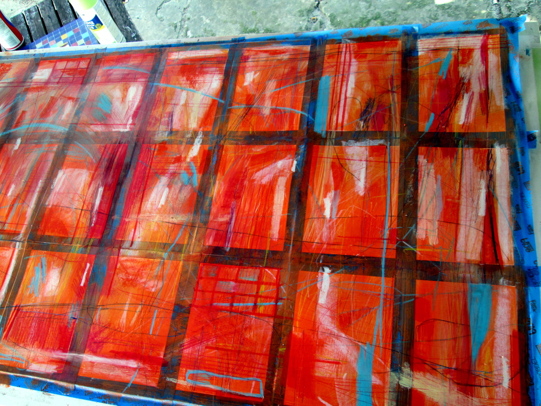
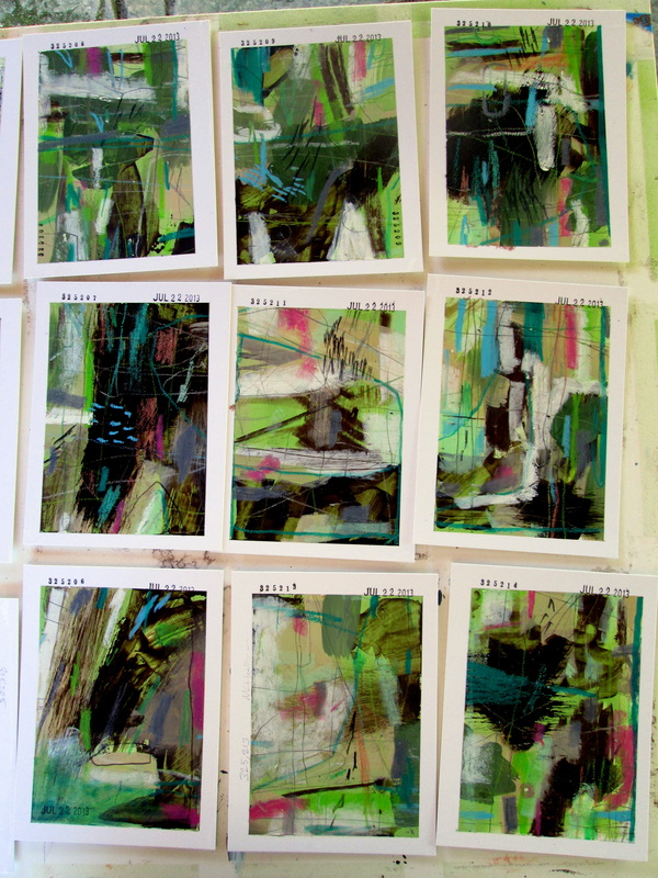
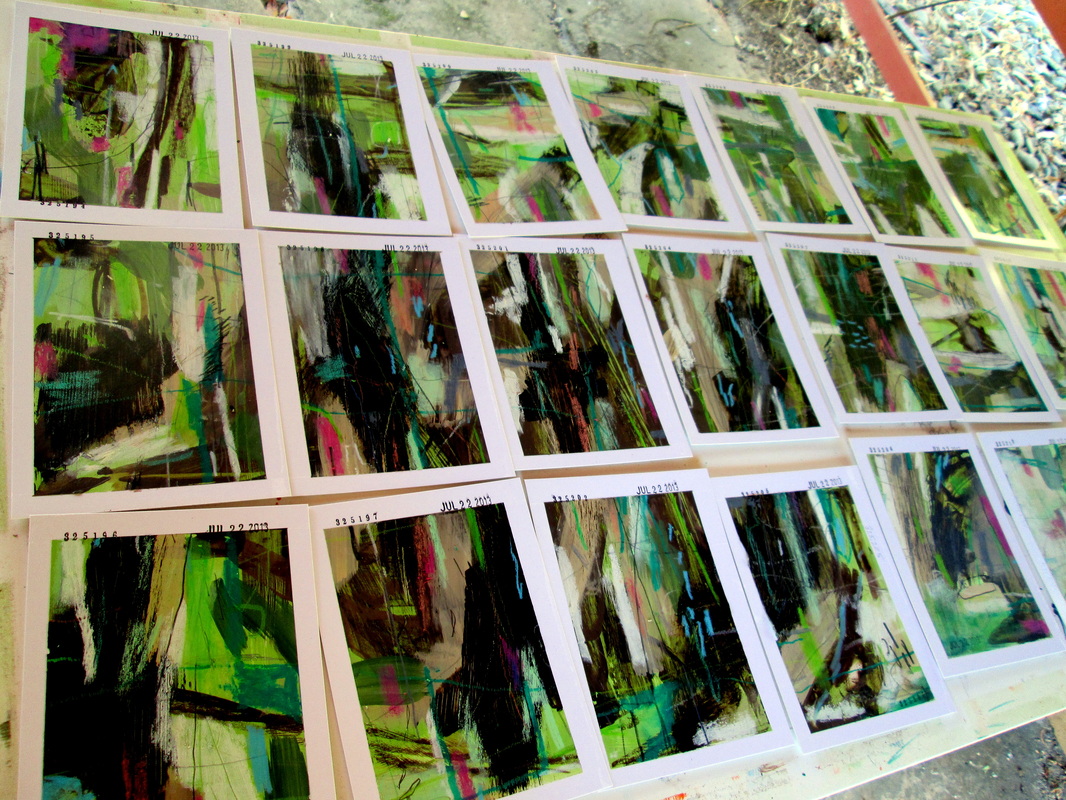
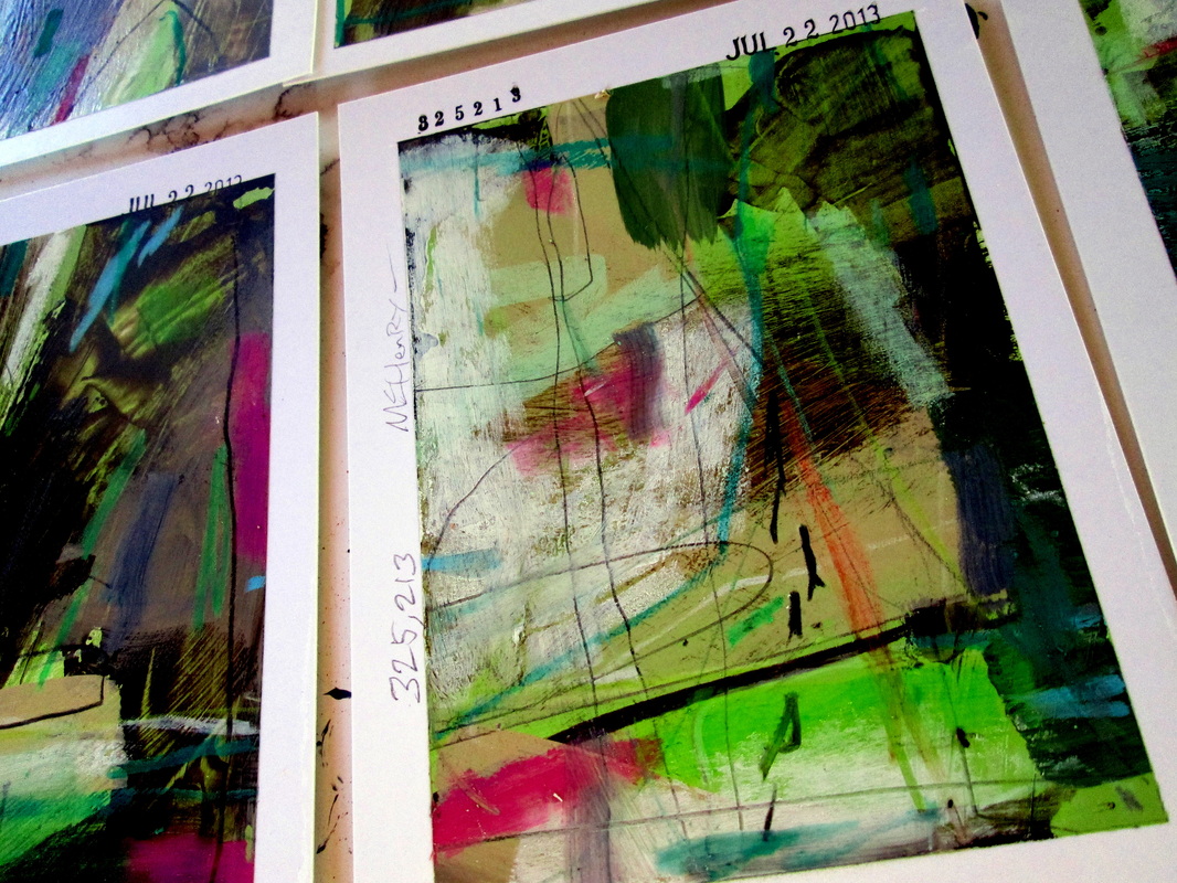
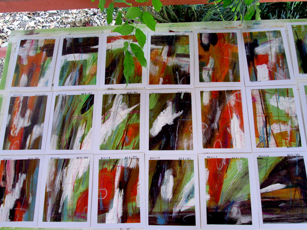
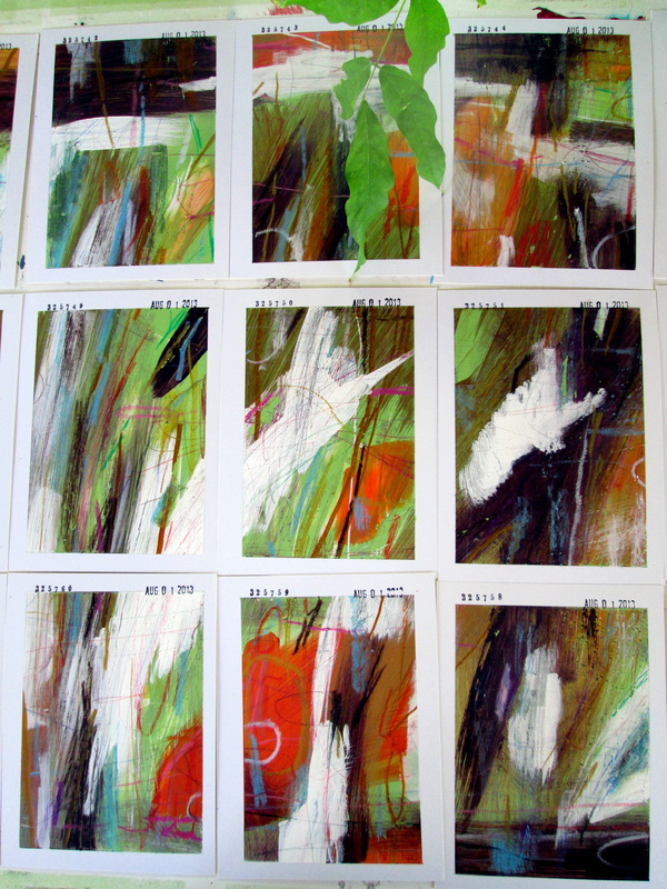
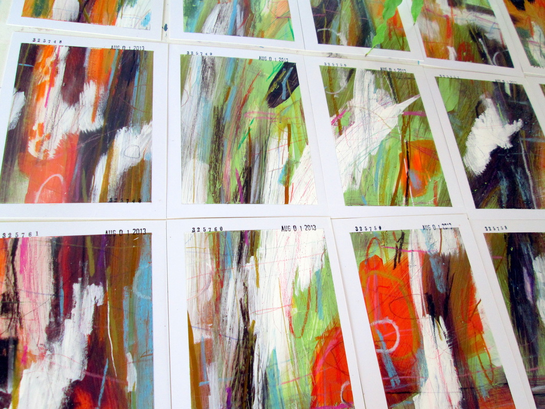
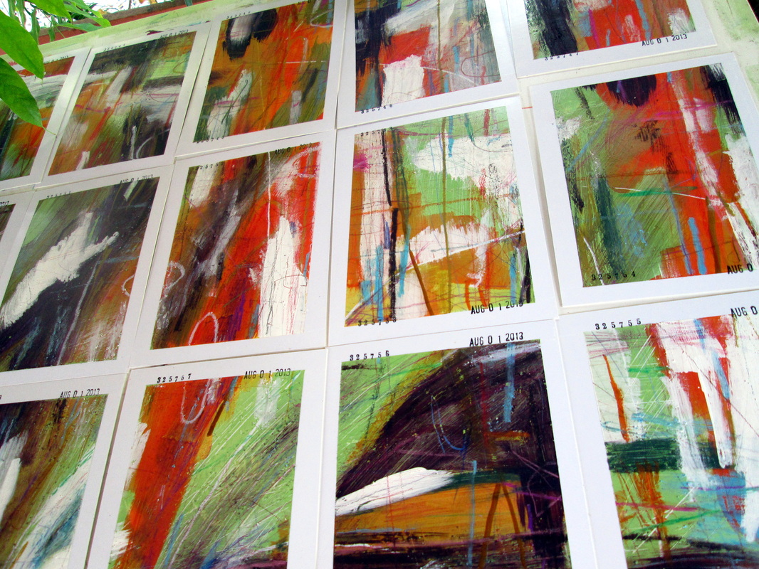
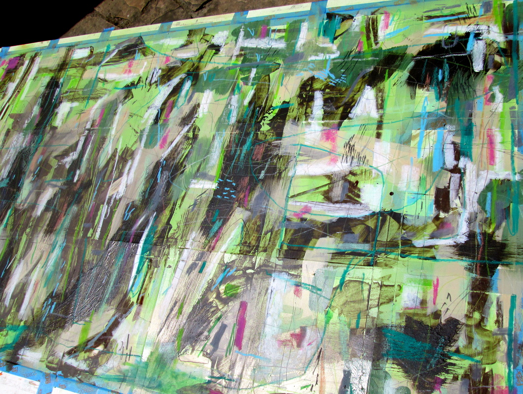
I'm including some process and overview photos as well.
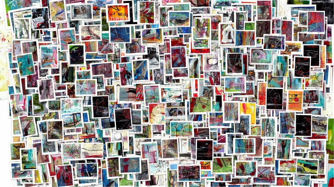
As always they are just beyond the old Read More break. Have at it.
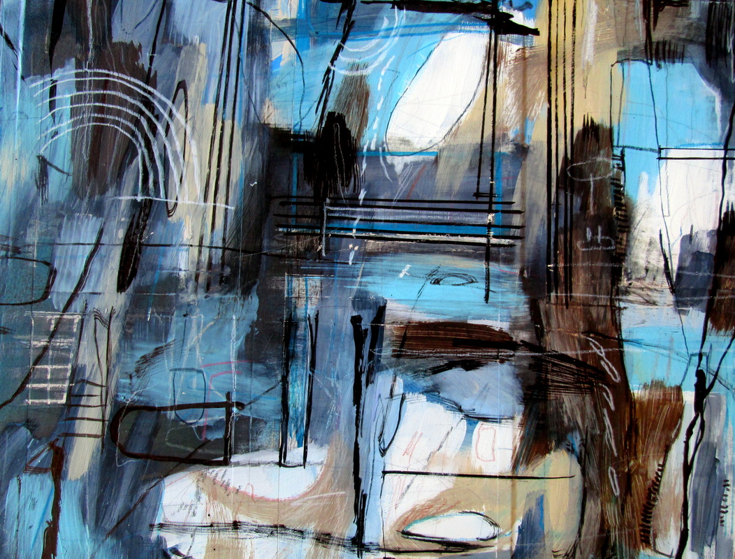
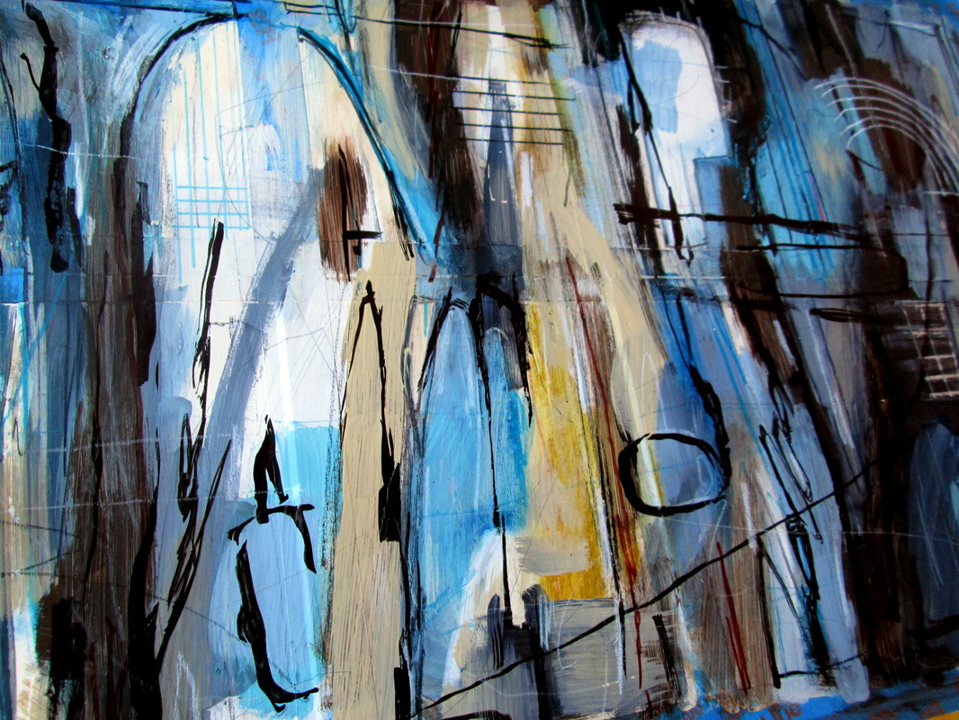
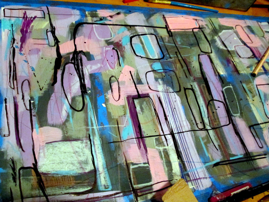
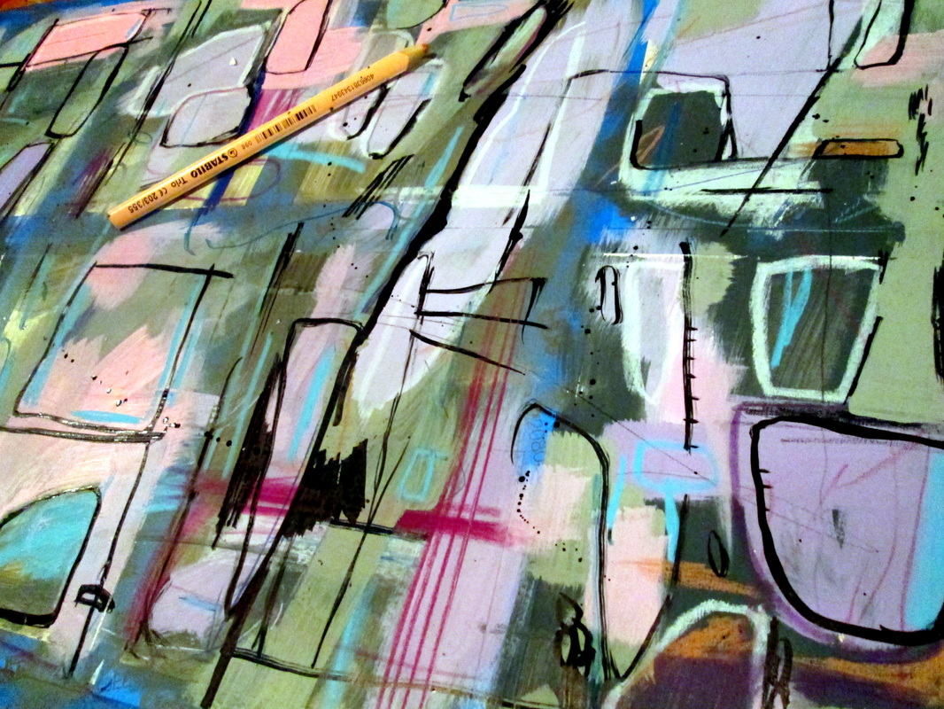
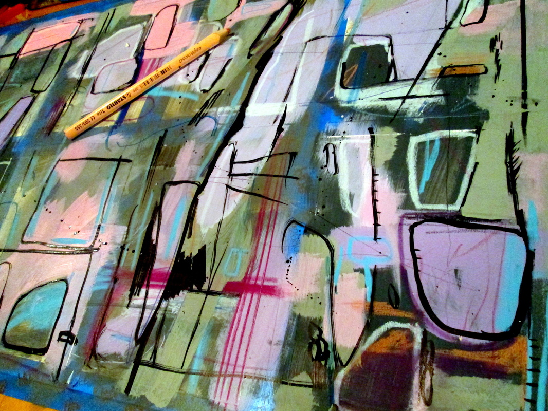
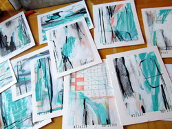
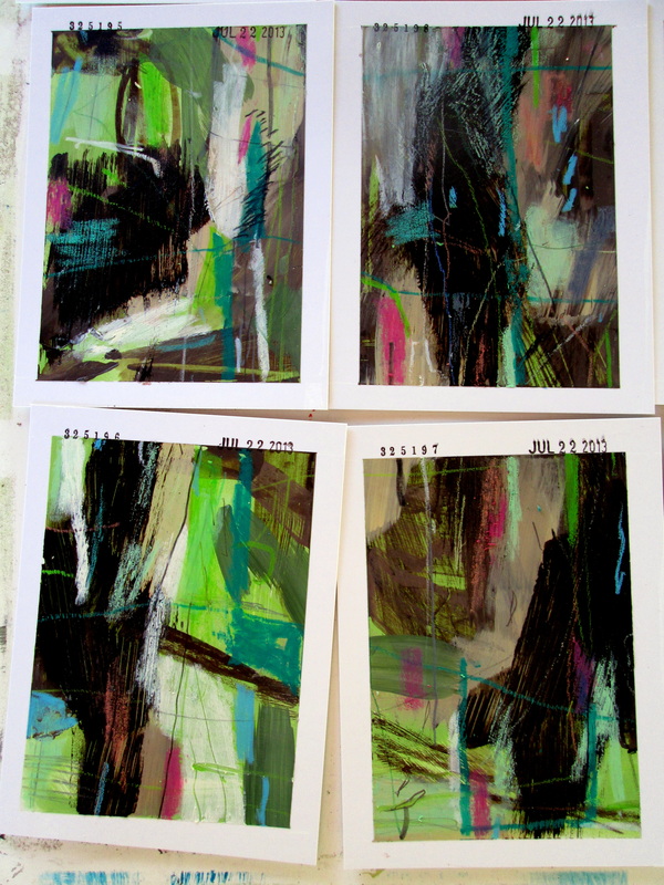
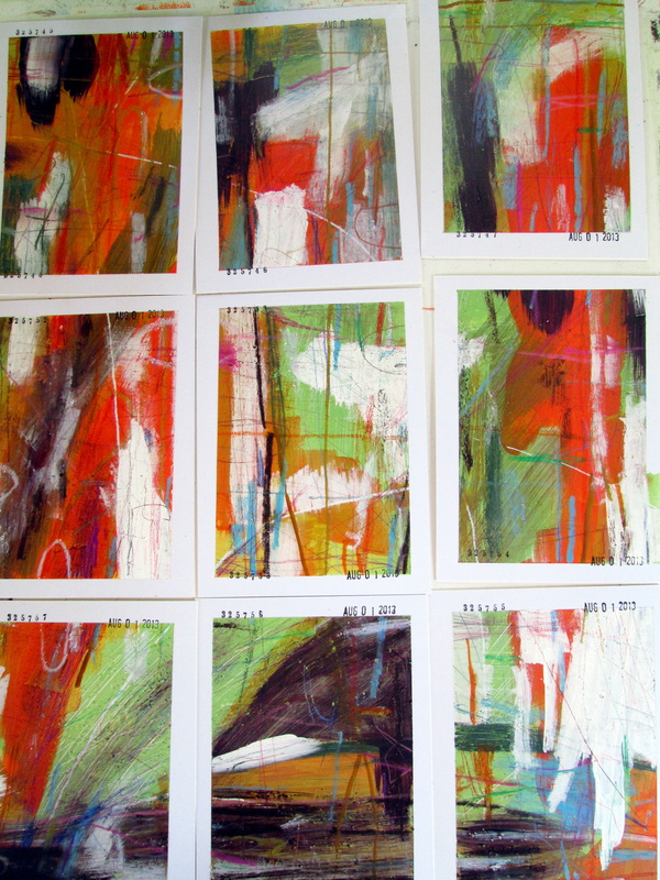
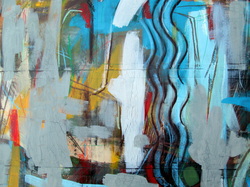
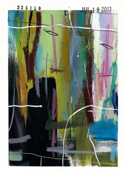
I'm including some process and overview photos as well.
As always they are just beyond the old Read More break. Have at it.


 RSS Feed
